By Rich Kizer and Georganne Bender, Kizer and Bender Speaking
www.kizerandbender.com
Shoppers these days are pretty vocal about what they like — and expect — from a trip to the store. Sure, there are the expected complaints about service, but more and more, we are hearing consumers complain about the in-store experience being underwhelming and too much of the same old same old. This may not be true in your store, but because customers carry past shopping trips with them, it does have an effect on how your store is perceived. According to a 2019 Salesforce survey, 50% of shoppers make second purchases within 16 days of their first, so doing things that thrill them, grab their attention and stop them in their tracks on your sales floor is critical to your success.
Now, customers who visit stores are generally there to do one of two things: Purchase specific items based on need, or browse the sales floor dreaming about future purchases. Whatever the reason, there are things that happen on your sales floor that either encourage customers to make a purchase or stop the buying process all together. We call these things shopper stoppers. Let’s take a look at some shopper stopper ideas that can be tweaked and utilized on your own sales floor.
The Good
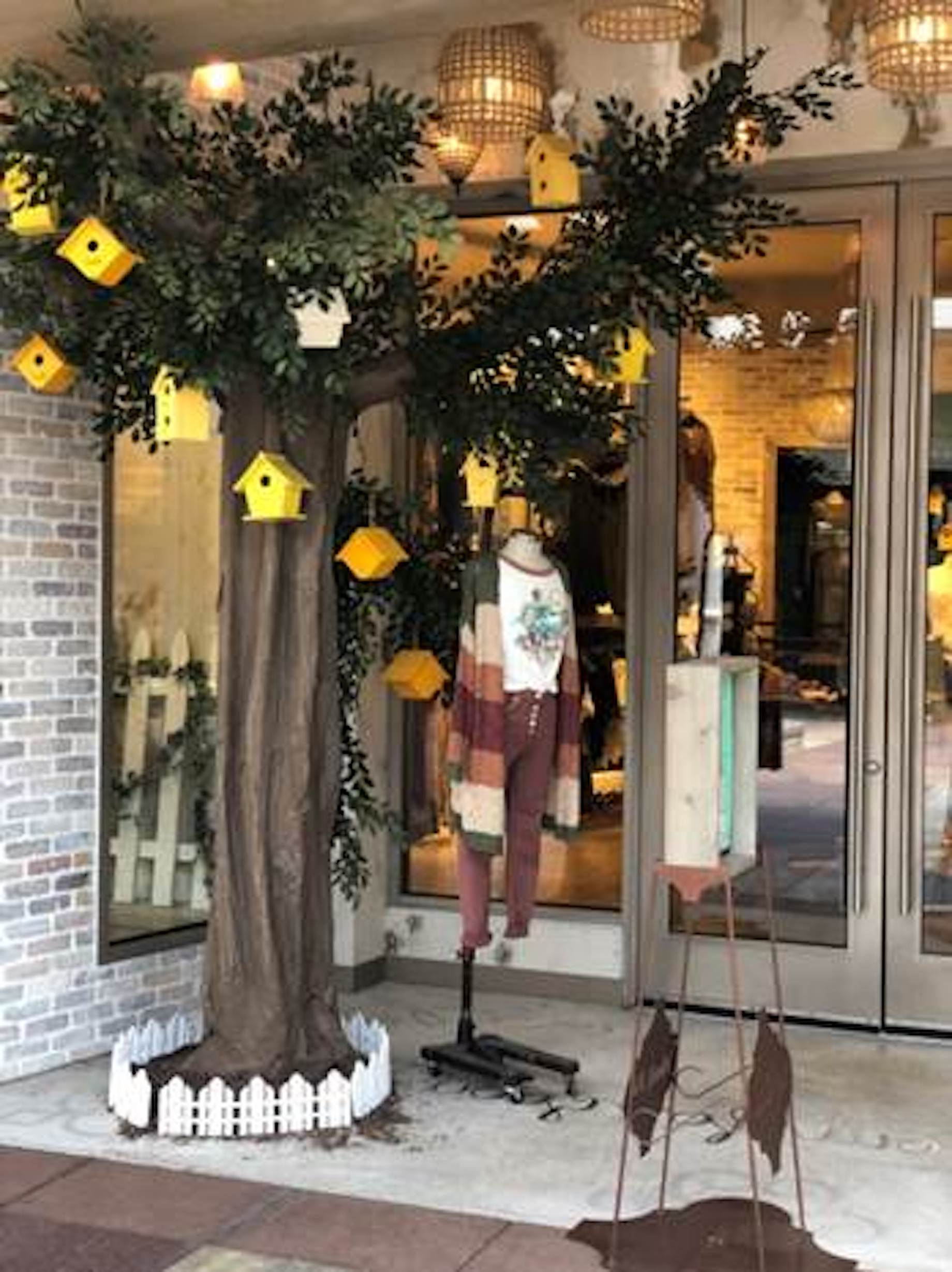
The merchandise on display outside Altar’d State brings the inside out. Think about it: Shoppers walking by your store may not know about all the cool things you have to offer, so why not give them a taste outside? The tree here is a certainly a shopper stopper. It’s a removable prop; the bird houses hanging from it are repeated in the themed decor inside the store. Walking in, there is a feeling of continuity that is carried from the outside in.
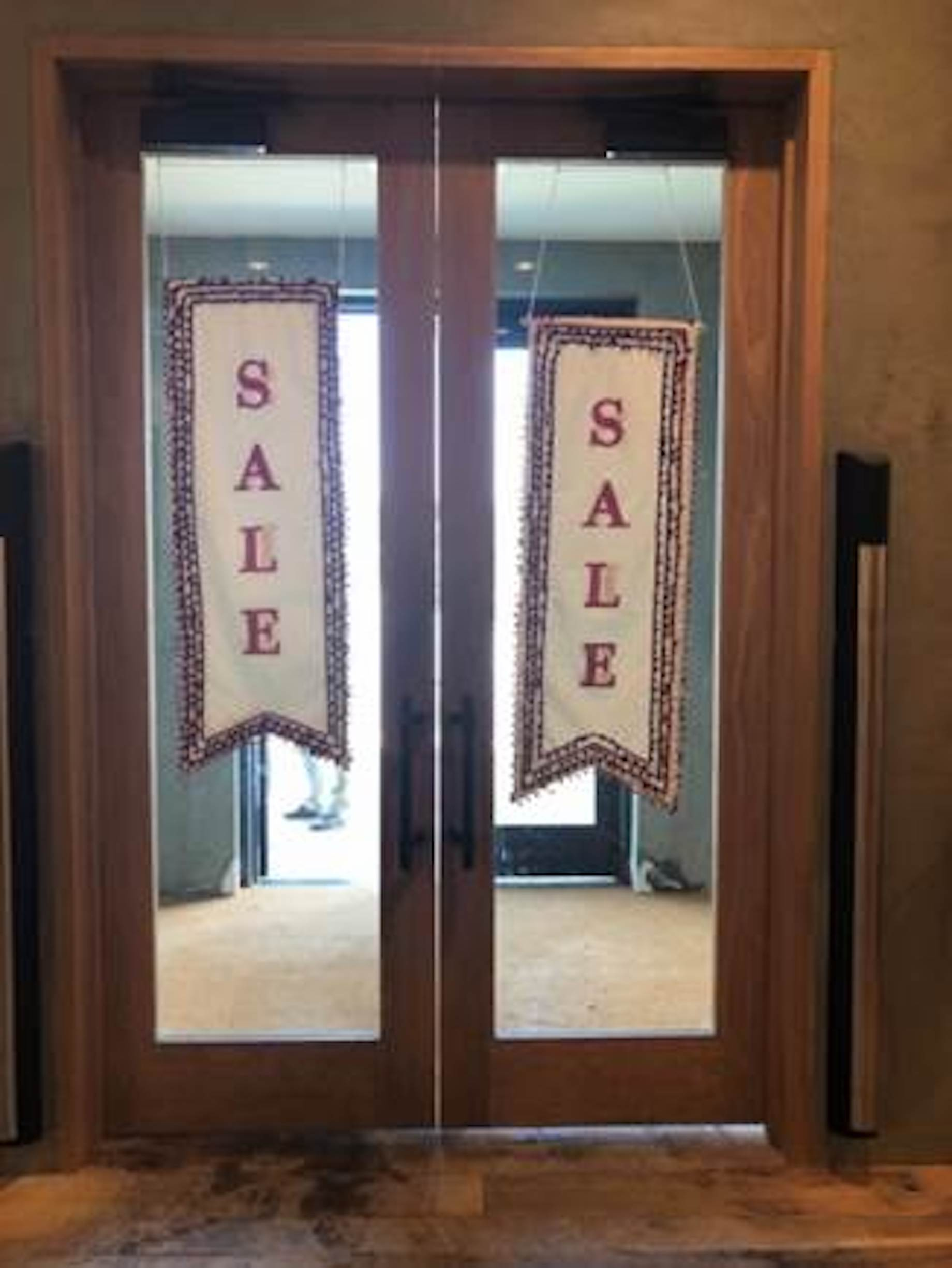
Anthropologie welcomes shoppers with in-your-face, double-sided, embroidered fabric sale signs. Not the expected sale sign, so this one really stands out.
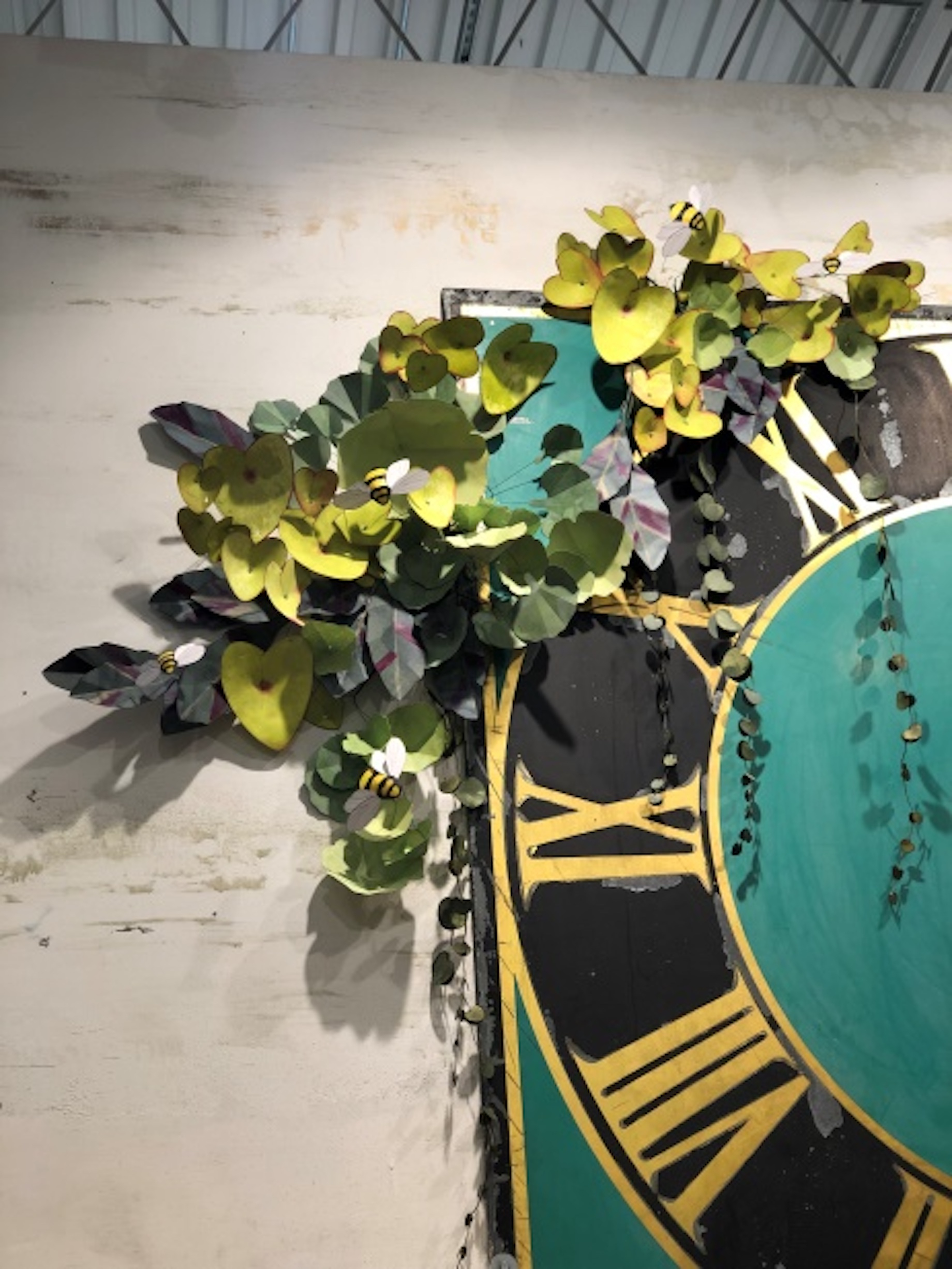
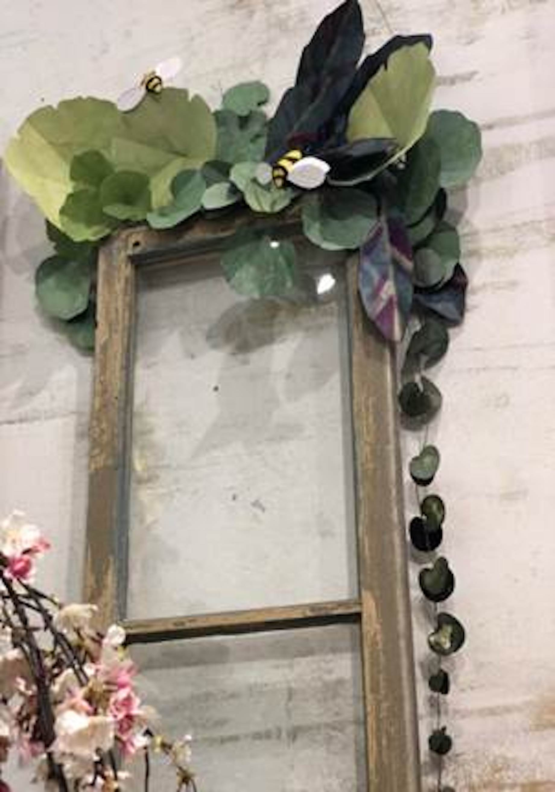
Anthropologie always does unique things displaywise using props that don’t cost a fortune. These paper floral bundles appear on fixturing and display pieces throughout the sales floor in just enough places to create a theme. It’s not overpowering, but it certainly is effective. We love that each one is accented with happy little bumblebees.
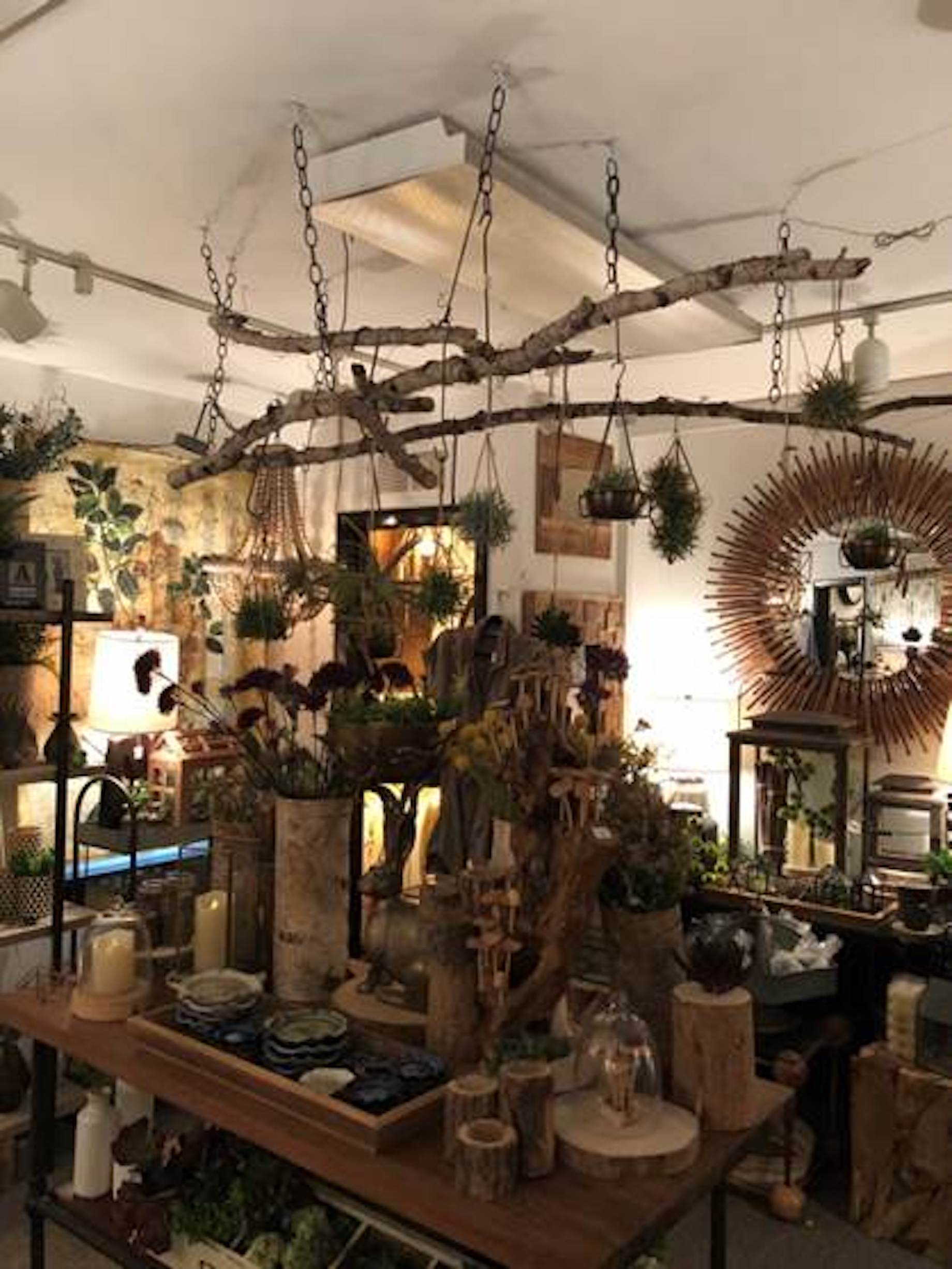
Cocoon in Geneva, Illinois, uses branches hung from the ceiling both as a focal point and as a means to display small items. How easy is this? All you need is a few branches and the means to hang them.
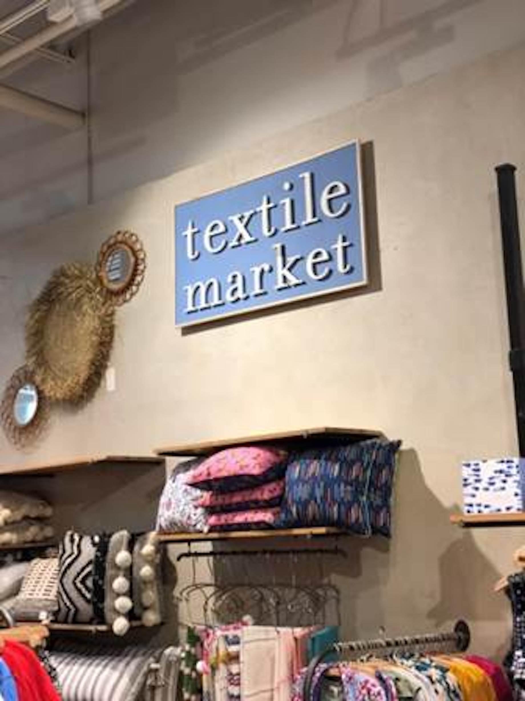
This Textile Market sign at Anthropologie adds a fun flair to the items merchandised below. It takes the shopper away from the this-is-a-store-in-a-mall mindset to that of an outdoor marketplace. A sign like this is perfect for a fabric, quilt or even apparel shop.
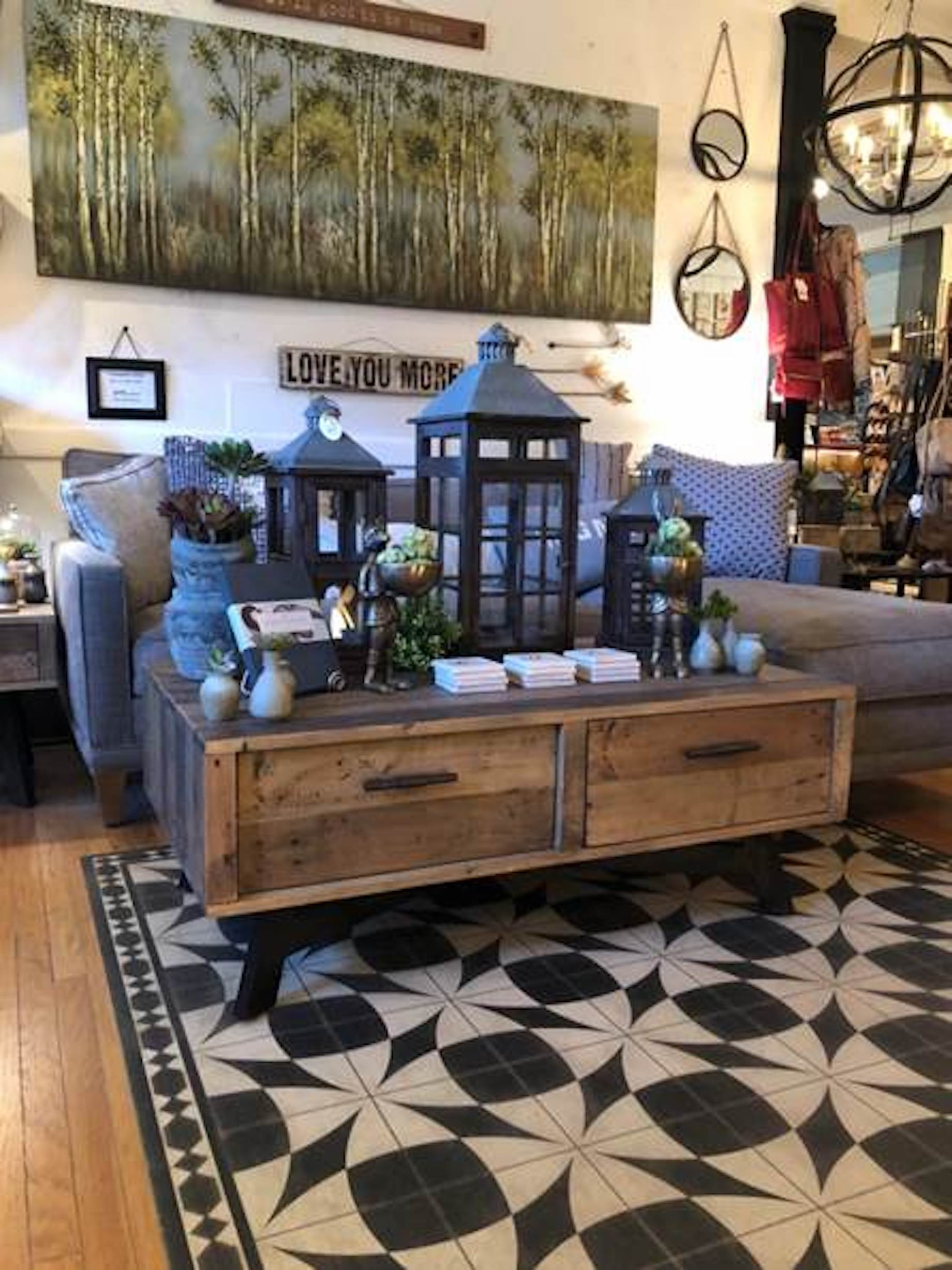
This display at Cocoon works the power of three. Studies indicate that grouping products in three encourages eye movement. When your eyes move around a display, you take more of it in. Note, too, that the tallest lantern is in the center, creating a pyramid effect, another visual merchandising trick to help you sell more products.
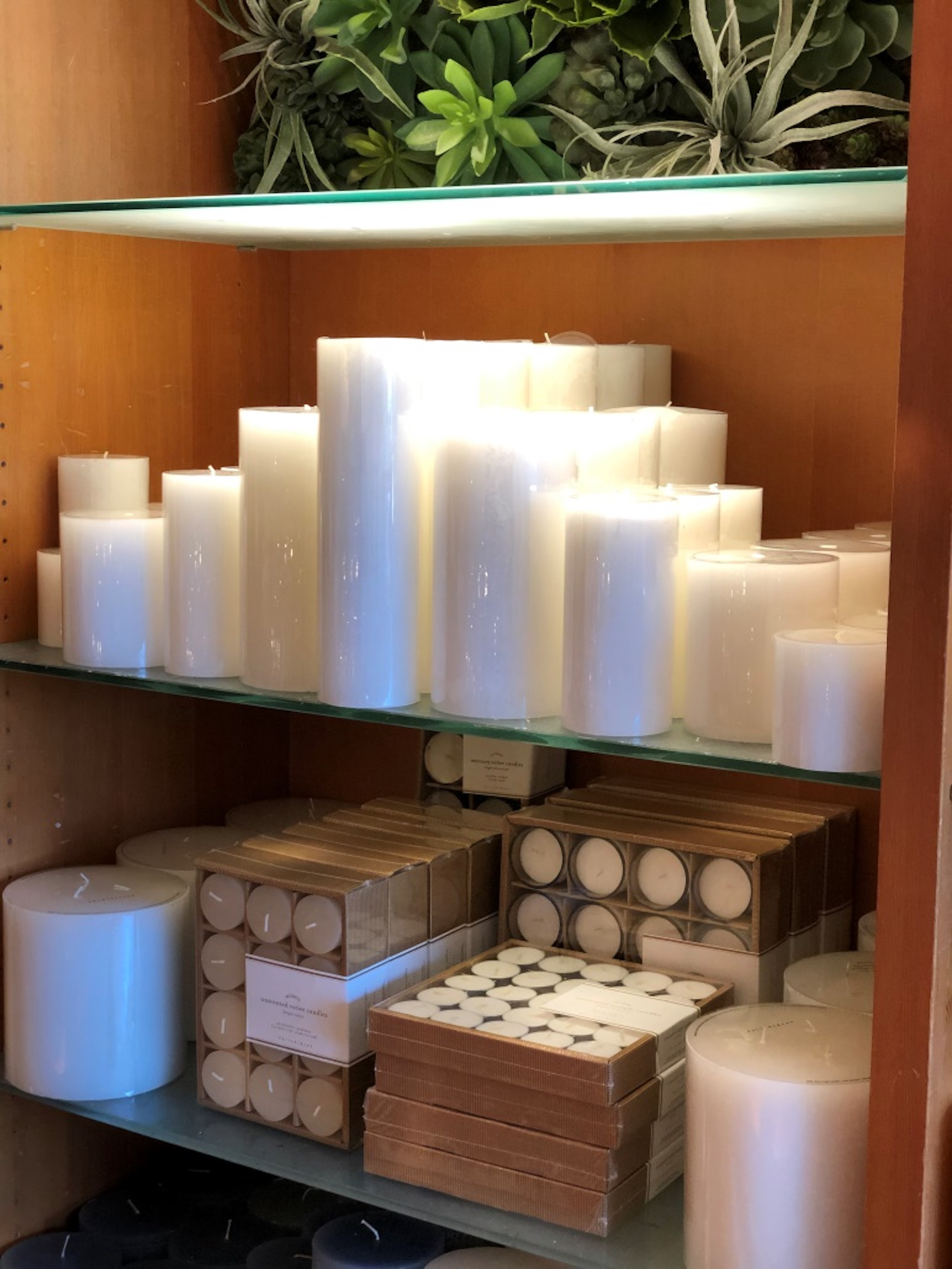
This display at Pottery Barn also relies on the power of the pyramid to create an interesting presentation of candles that come in five sizes. The pyramid causes the eye to move over the entire assortment.
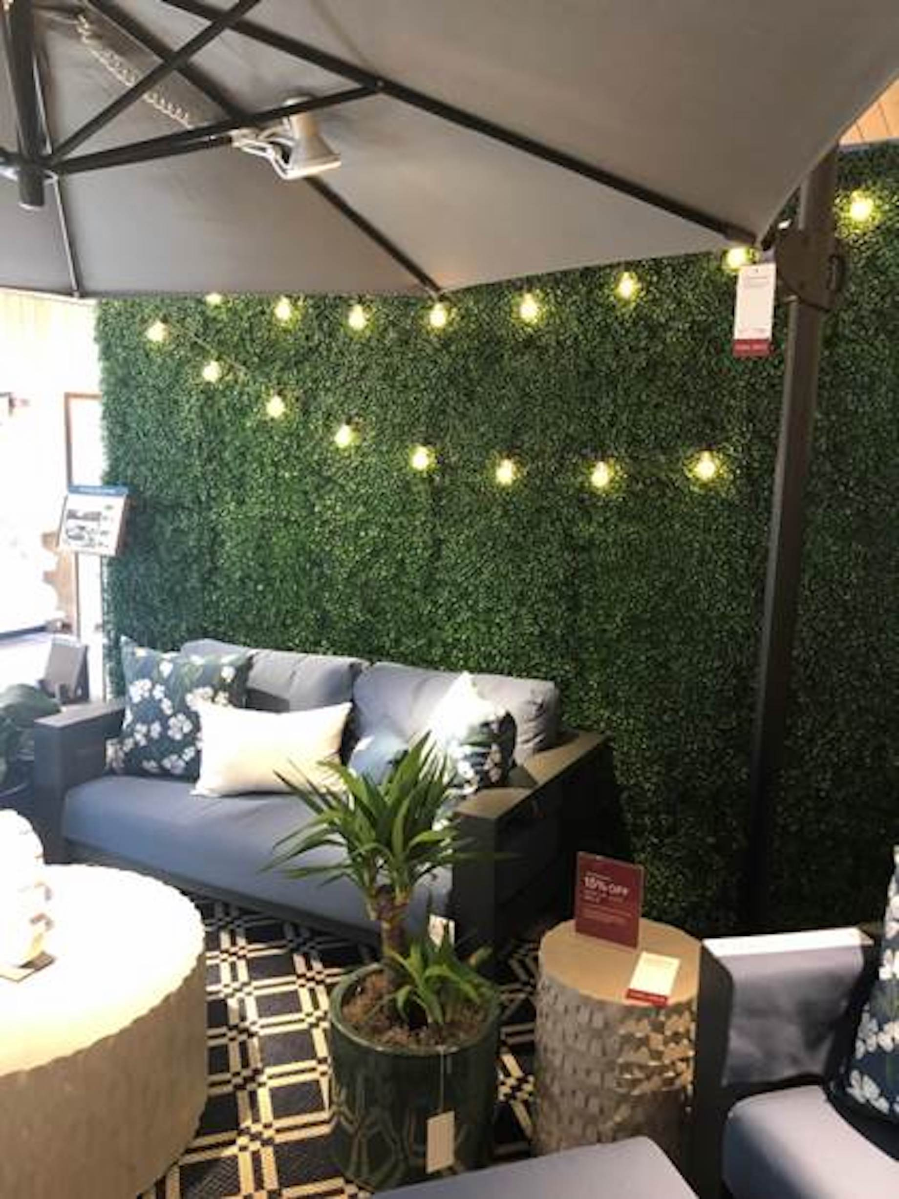
Green walls are a hot trend in store and home decor right now. In this example, Crate & Barrel uses a grass turf rug to set a grouping of outdoor furniture apart from the rest of the sales floor. It’s a customer draw because the color combined with decorative lighting is striking. This ain’t your basic Brady Bunch backyard AstroTurf!
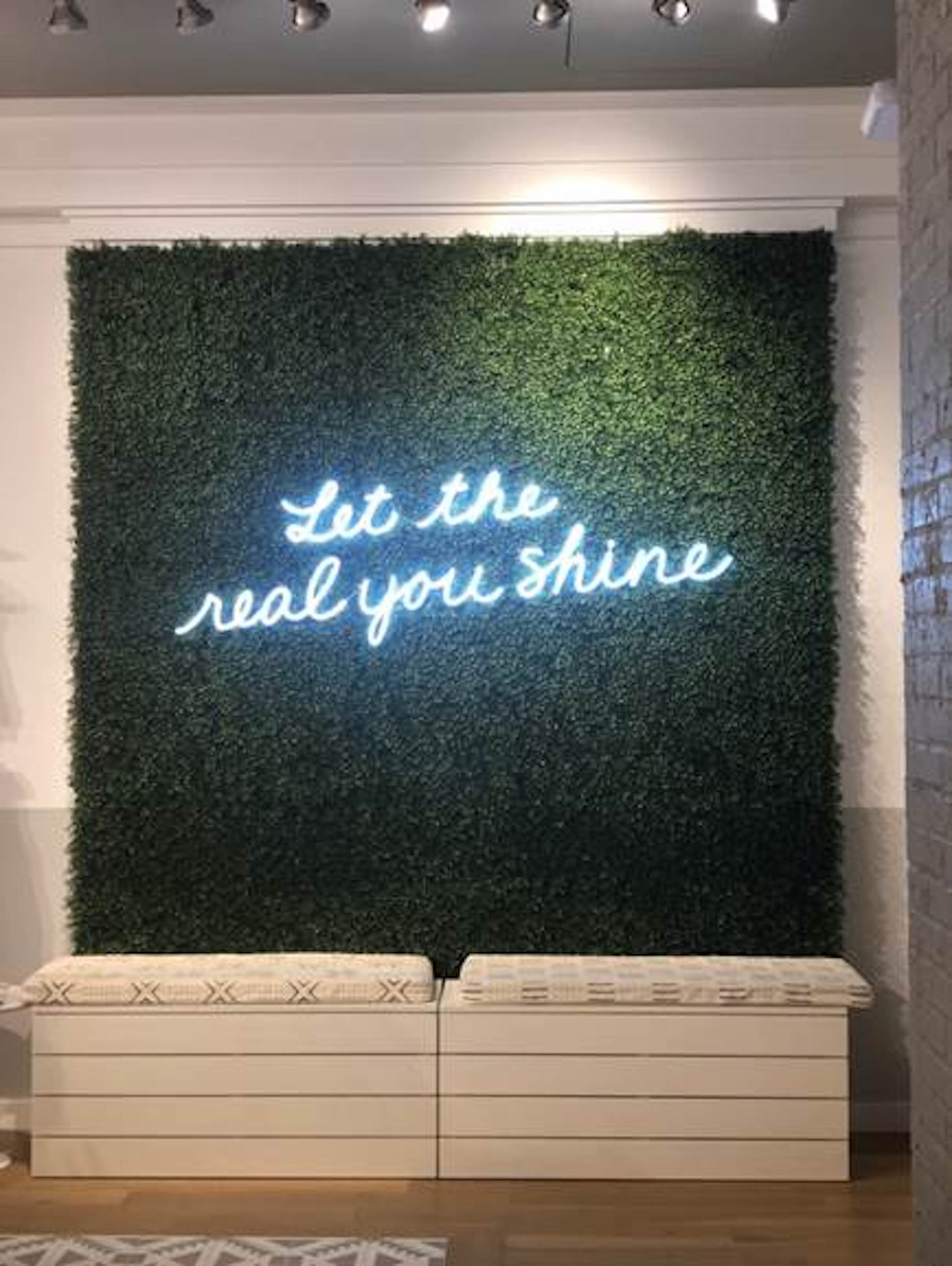
This Instagrammable grass turf rug at Aerie might be a place to park your significant other while you shop, or it might be just the place to take a selfie. Add your store’s hashtag, and you’re good to go.
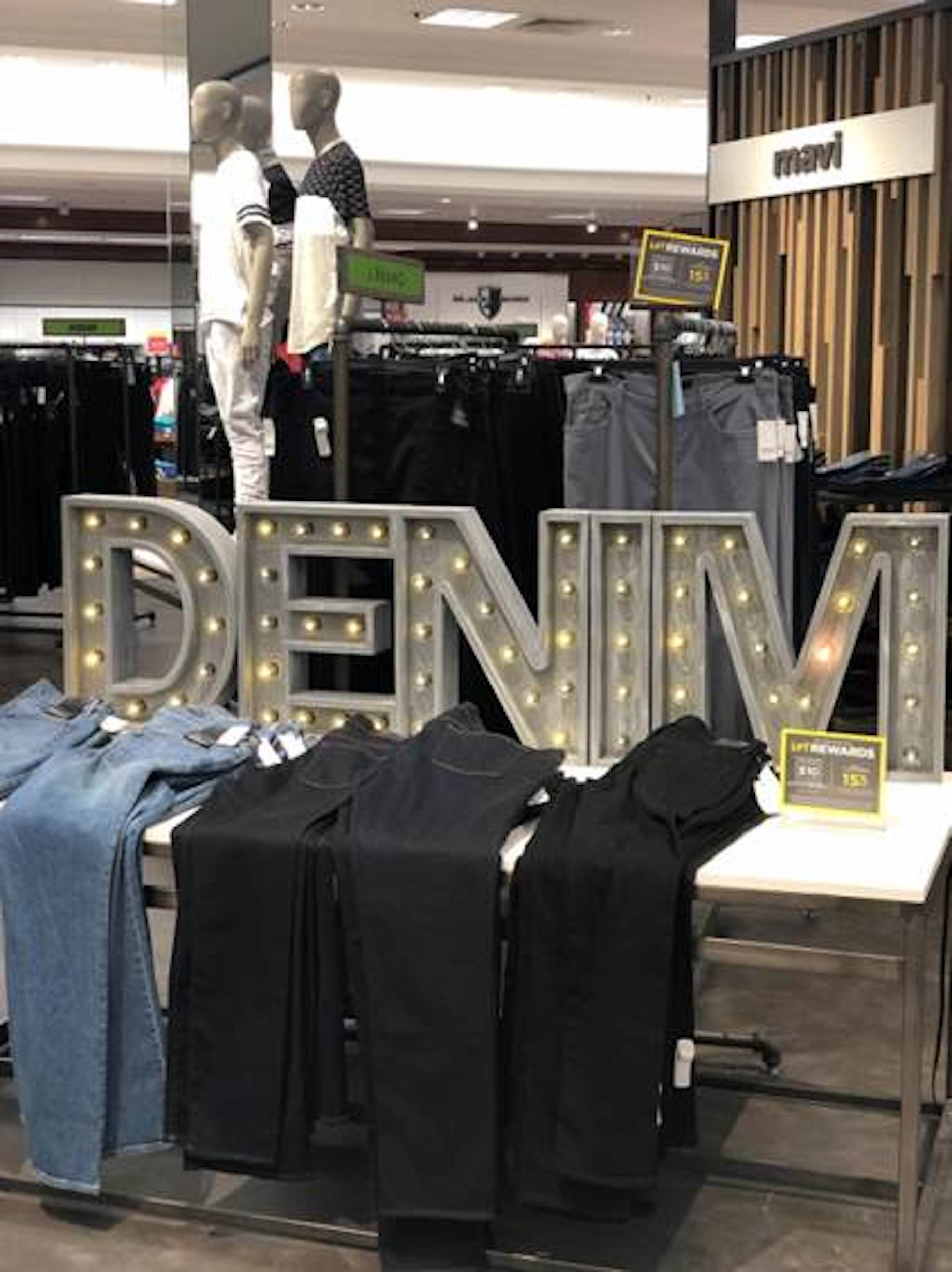
This one-dimensional display of jeans at Lord & Taylor isn’t going to stop traffic, but add the word “denim” in capital letters and lit up, and the display stands out. Light up letters like this can be found in any big craft store.
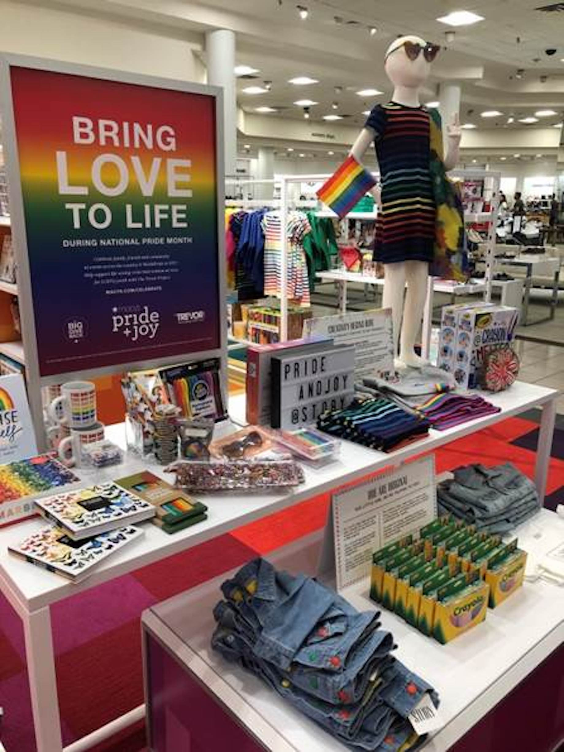
Story is a store-within-a-store at Macy’s that invites shoppers you to explore small business brands and products. Story rotates its displays every few months. The first was all about color; the rainbow displays were a good fit for Pride Month, as well. Remember that shoppers are drawn to color, so bold groupings always make for good displays. Creative signing – Hue are Original and Creativity Begins Here – enhances the color theme.
You’d think that this product is from a single collection, but it’s not. The grouping of similar patterns and like colors makes it a standout anyway. Don’t be afraid to mix colors and patterns in your displays. If it looks good to you, it works.
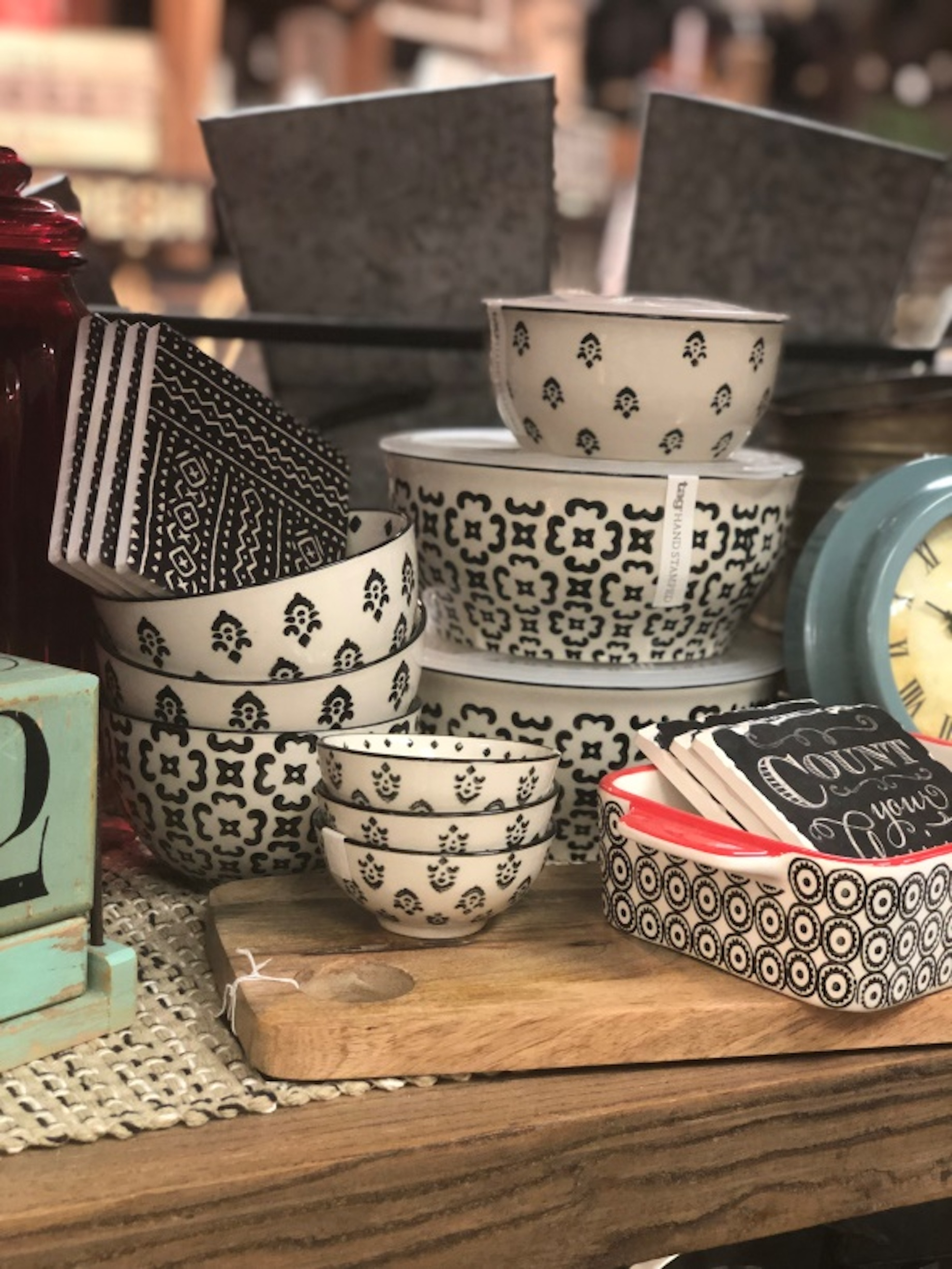
Unusual groupings make solid shopper stoppers, but they can’t be so busy that the shopper is afraid to play with the merchandise. Here, the combination of aluminum, black-and-white and hints of blue make this display a fun treasure hunt. And because all the items look good together, the display encourages multiple sales.
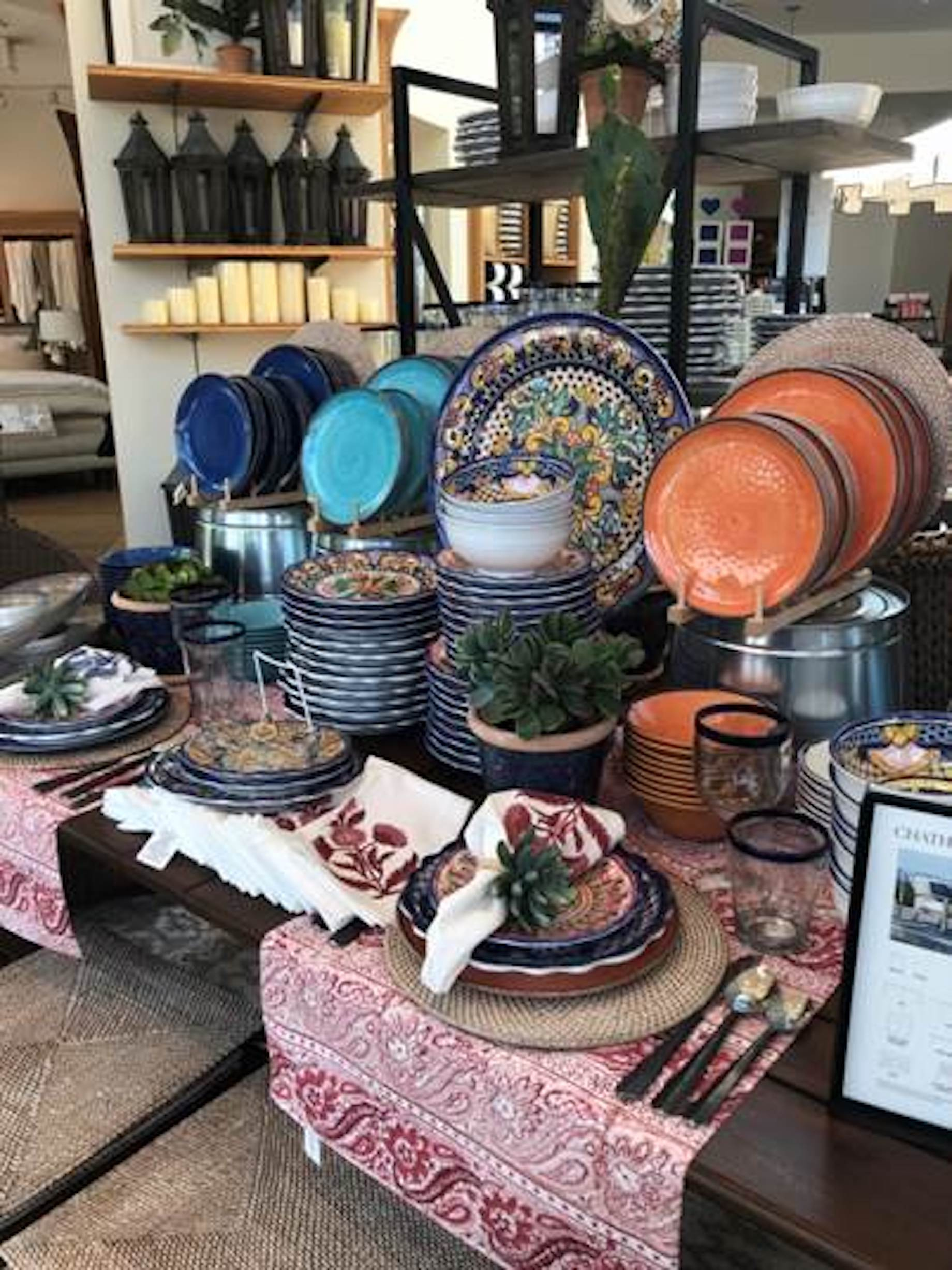
Here’s another example of a coordinated color grouping, at Crate & Barrel. The multicolored dishes in the center anchor the entire display. Notice the pyramid of candles in the background.
Latest from GlobalShop
We recently attended GlobalShop, a retail industry design, planning and merchandising expo and conference. The show floor was packed with every kind of display prop and fixture you could ever imagine, but the biggest trend was the use of visuals to bring product to life or to set the stage for product displays. There were lots of light boxes; backlit and LED signs, some interactive to further engage shoppers; and murals and posters featuring realistic scenes. Here are a few of the things that stopped us:
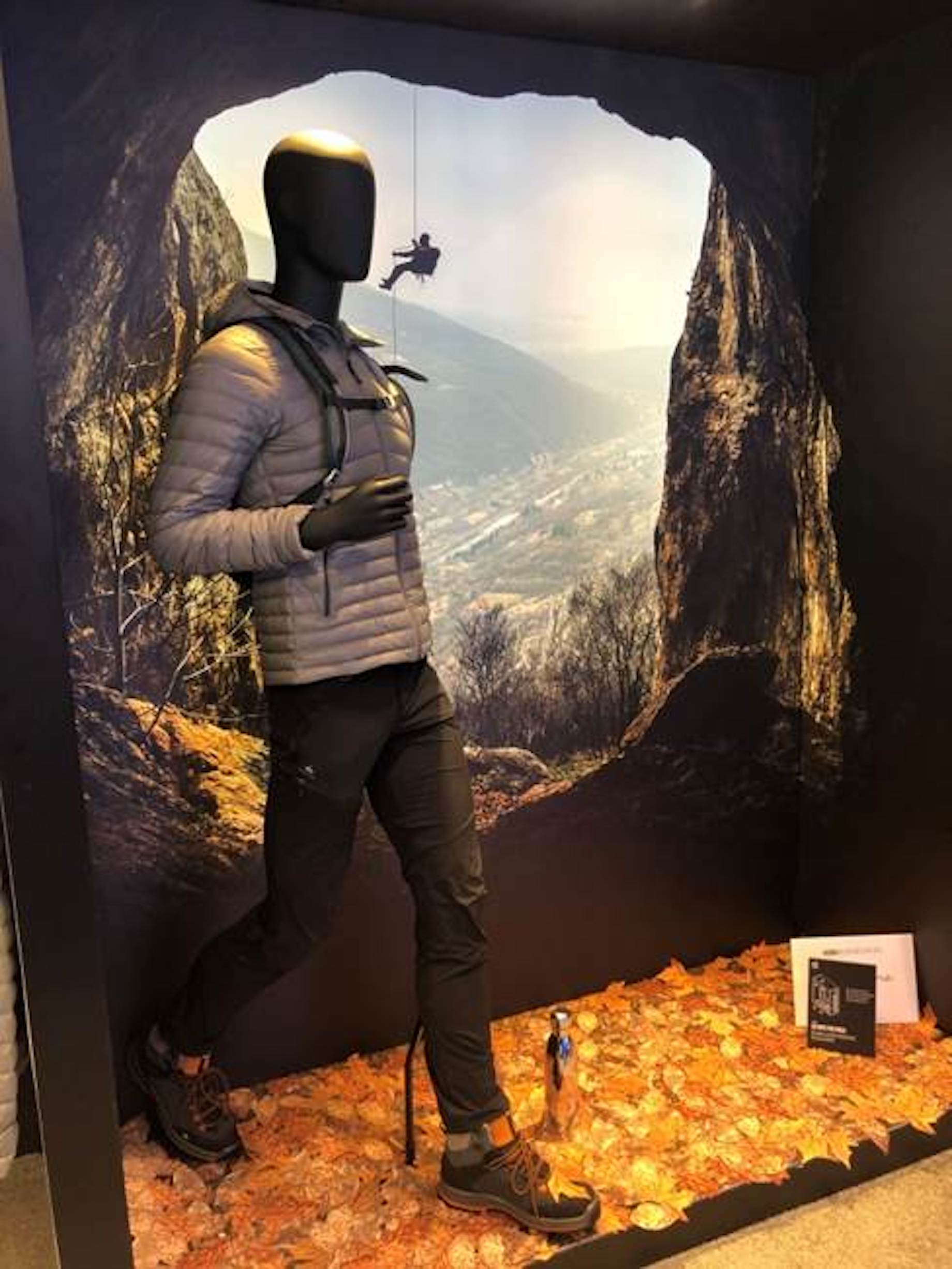
The Kendu booth offered a guided tour of more than 15 interactive experiences that featured the latest in-store communication innovations like the backdrop in the vignette above. It really looked like the mannequin was out for a hike.
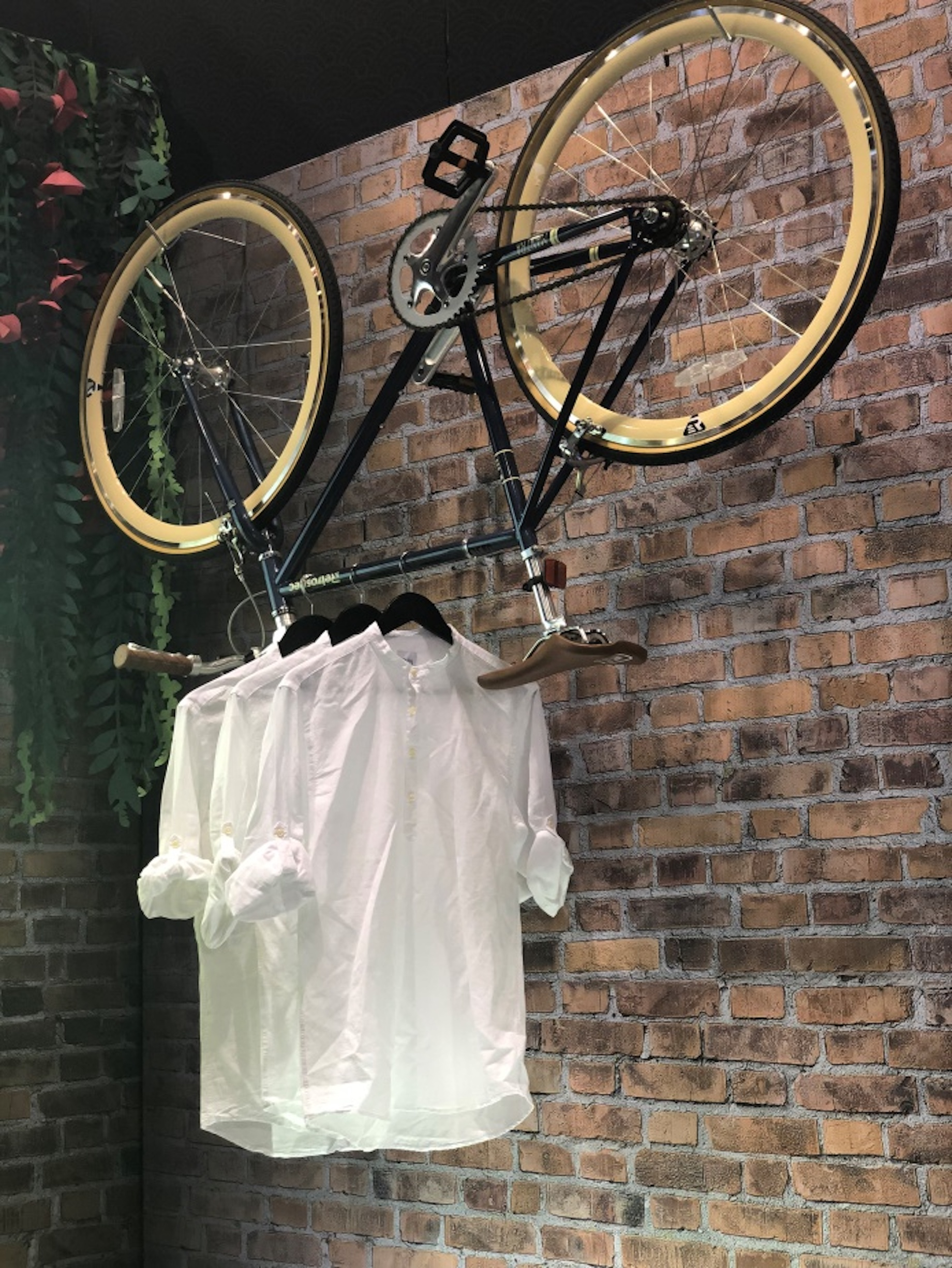
This faux brick wall in the Kendu vignette is definitely a shopper stopper, but we were intrigued by the use of a bicycle as a fixture. Can you imagine what you could do on your sales floor with an old bicycle? Maybe one in 1950s ice cream colors? And how cool would that ’50s bike look outside your front door with a sign hanging on it?
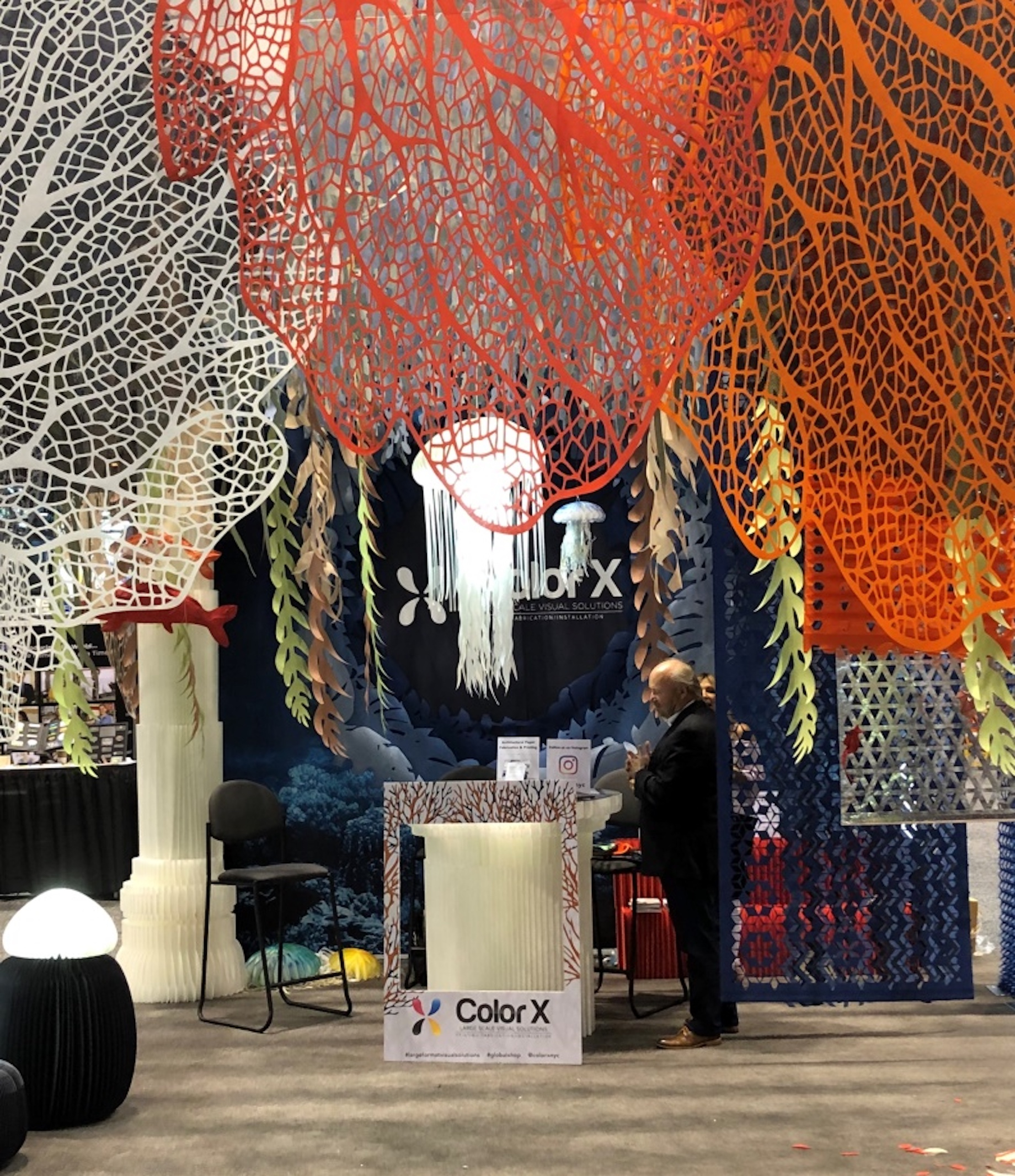
The Color X booth featured inexpensive, recyclable, sustainable, fireproof paper props that can be used as backdrops to add color and interest to the sales floor, to fill windows, to wrap fixtures in color or to create pop-up shops. Perhaps you’ve been kicking around doing a specialty grouping or pop-up shop on your sales floor? Paper props can help you set the stage.

Think big! Letters like this can be used in a number of ways to create interest in your windows and as props throughout the store.
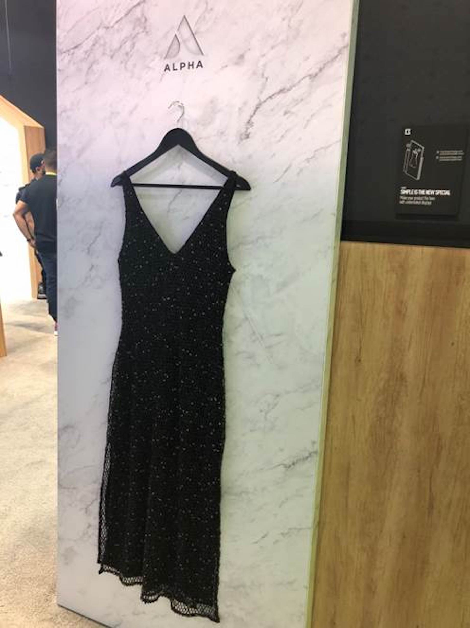
Simple was highlighted in the Alpha booth, where signing read, “Simple is the new special. Make your product the hero with understated displays.” This is a trend we have seen for years in upscale and designer shops, but it’s starting to catch on in all sorts of stores. Minimal displays highlight the product and stop shoppers because they’re unexpected.
Eye on Signing
One thing that always stands out during our store visits is the misuse or lack of store signing. When used correctly, signs can have a significant impact on sales. On your sales floor, you definitely need plenty of signs set at eye level to help customers make informed buying decisions. Eye level, aka buy level, is 5 feet, 4 inches from the floor, the height of the average American woman.
Storyteller signs rely on verbs to engage shoppers, as in, “Imagine how great this quilted runner will look on your holiday table!” Product-seller signing is important, as well, because it highlights a product’s important features. Point-of purchase materials provided by vendors should also be displayed at eye level.
Display your signs in professional sign holders that are available from any store fixture company, or try Plexiglas photo frames that are available in all sizes at craft stores. Create a template on your computer that you can use over and over. Include your store name or web address in a smaller font across the bottom of each sign, and print your signs on quality cardstock.
This easel-backed sign at Anthropologie carries the theme of the current seasonal decor. The border on the sign caught our interest and brought us in for a closer look, but the fine print is too small for anyone to easily read. Remember the rule: Take the typical age of your oldest customers and divide it in half; that’s the smallest size font you can use on your signs. Play it safe and never use anything smaller than a 30-point font in your store signing.
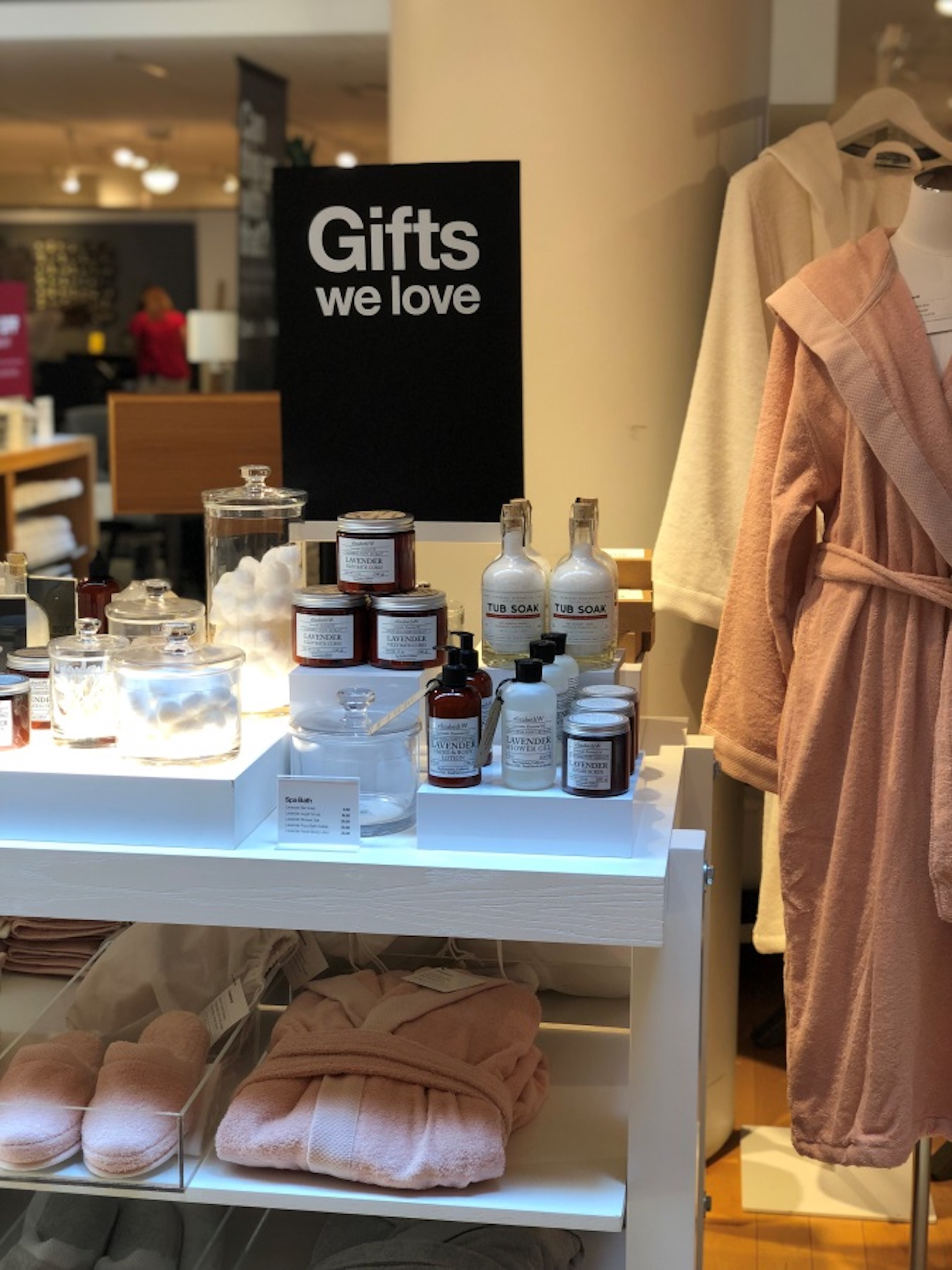
This generic “Gifts we love” display was a shopper stopper at Crate & Barrel, but on your sales floor it could be brilliant. Shoppers have different connections with independent retailers; they want to know what you like and recommend. A “Gifts we love” table in your store, especially at busy times of the year, is a no-brainer.
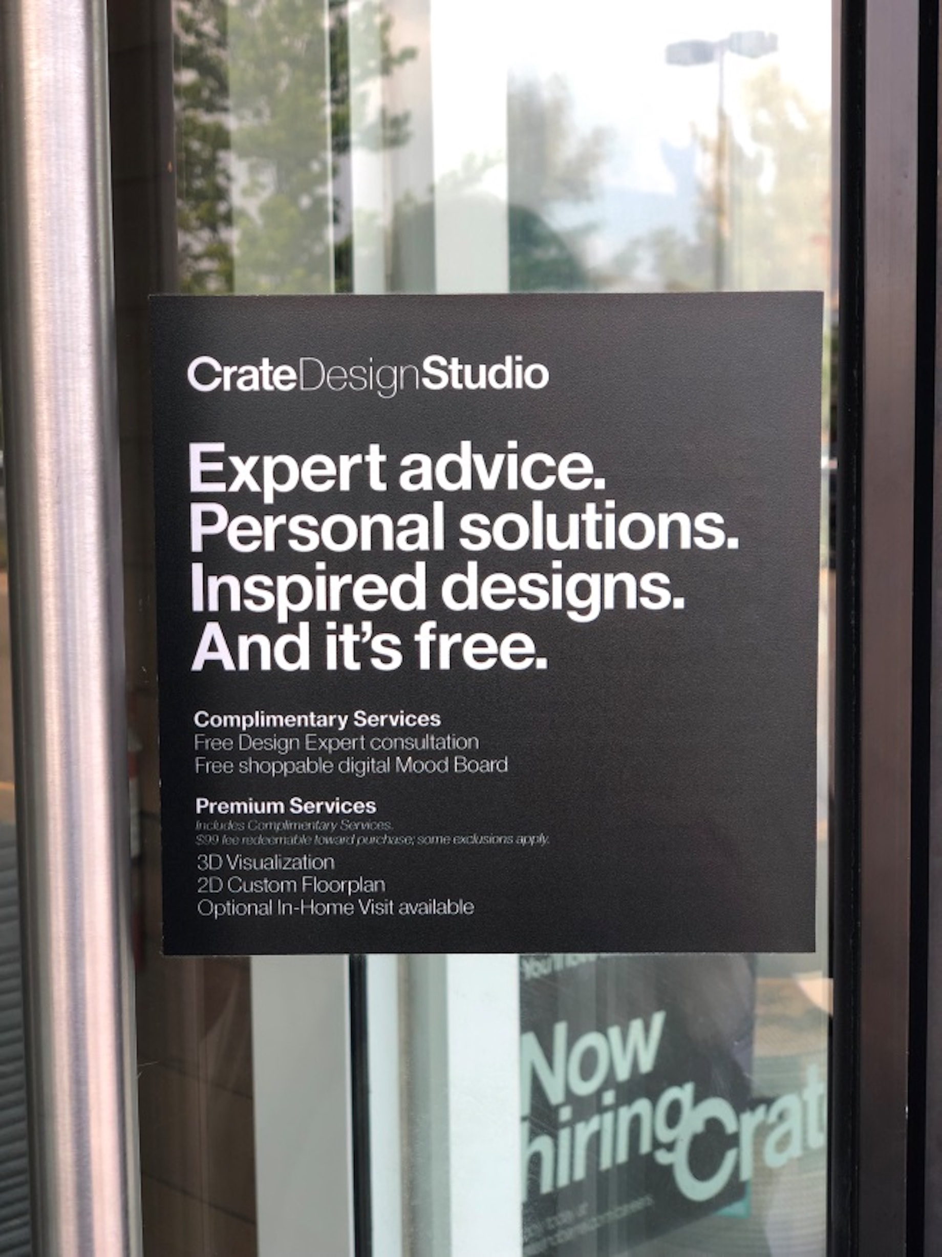
This little sign at Crate & Barrel was only about 4 inches by 4 inxhes, but it made a big impact. We saw it affixed to the front door and on displays throughout the store offering expert advice, personal solutions, inspired designs and more. Customers won’t know about your services unless you tell them.
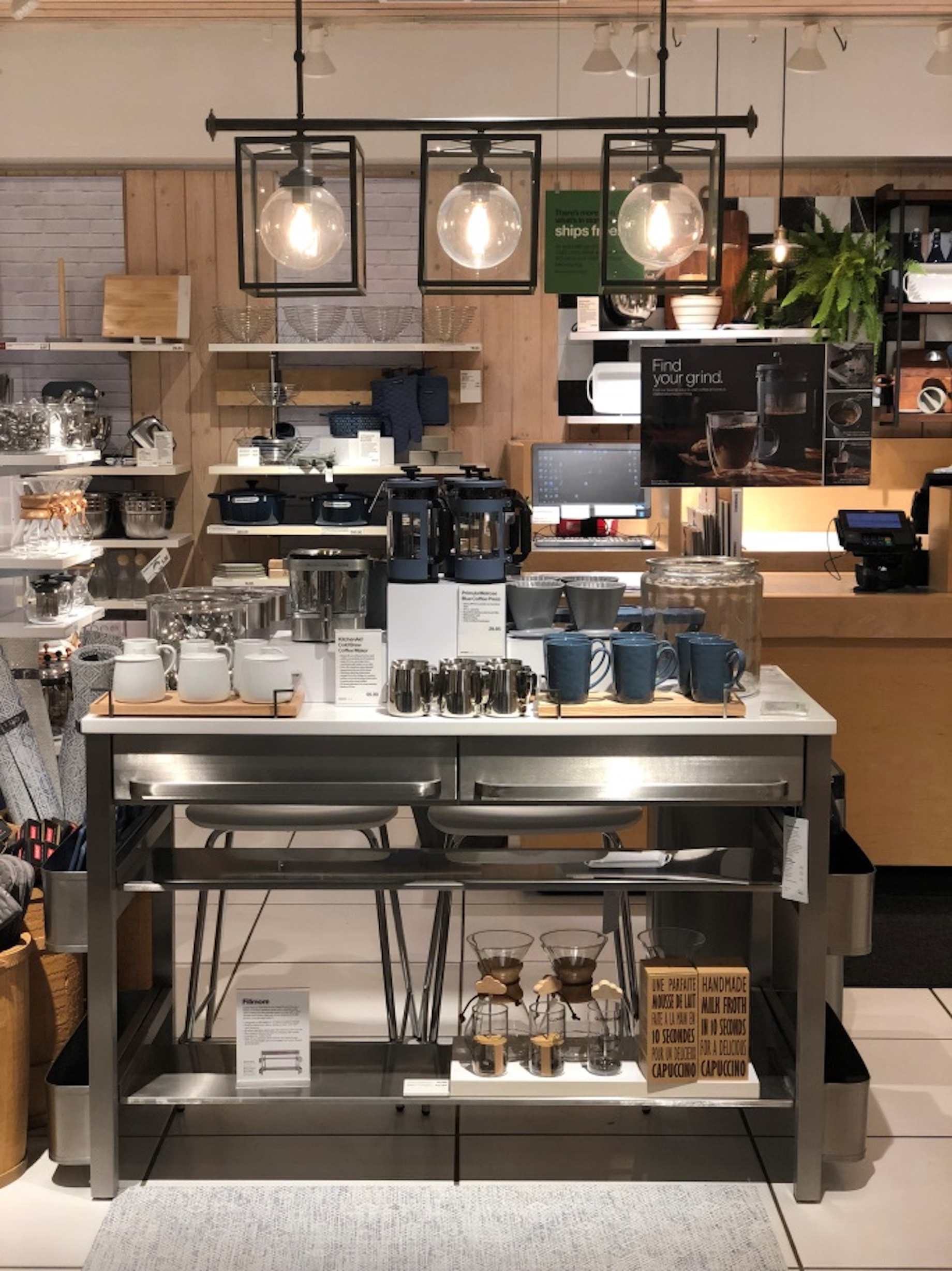
One more from Crate & Barrel. See that sign at the top right of the display? It appears to be floating in air because it’s hung with fishing line. This is a good way to add signing without taking up precious display space. The signs located at the center of the display are product-sellers that list the important features of the coffee makers.
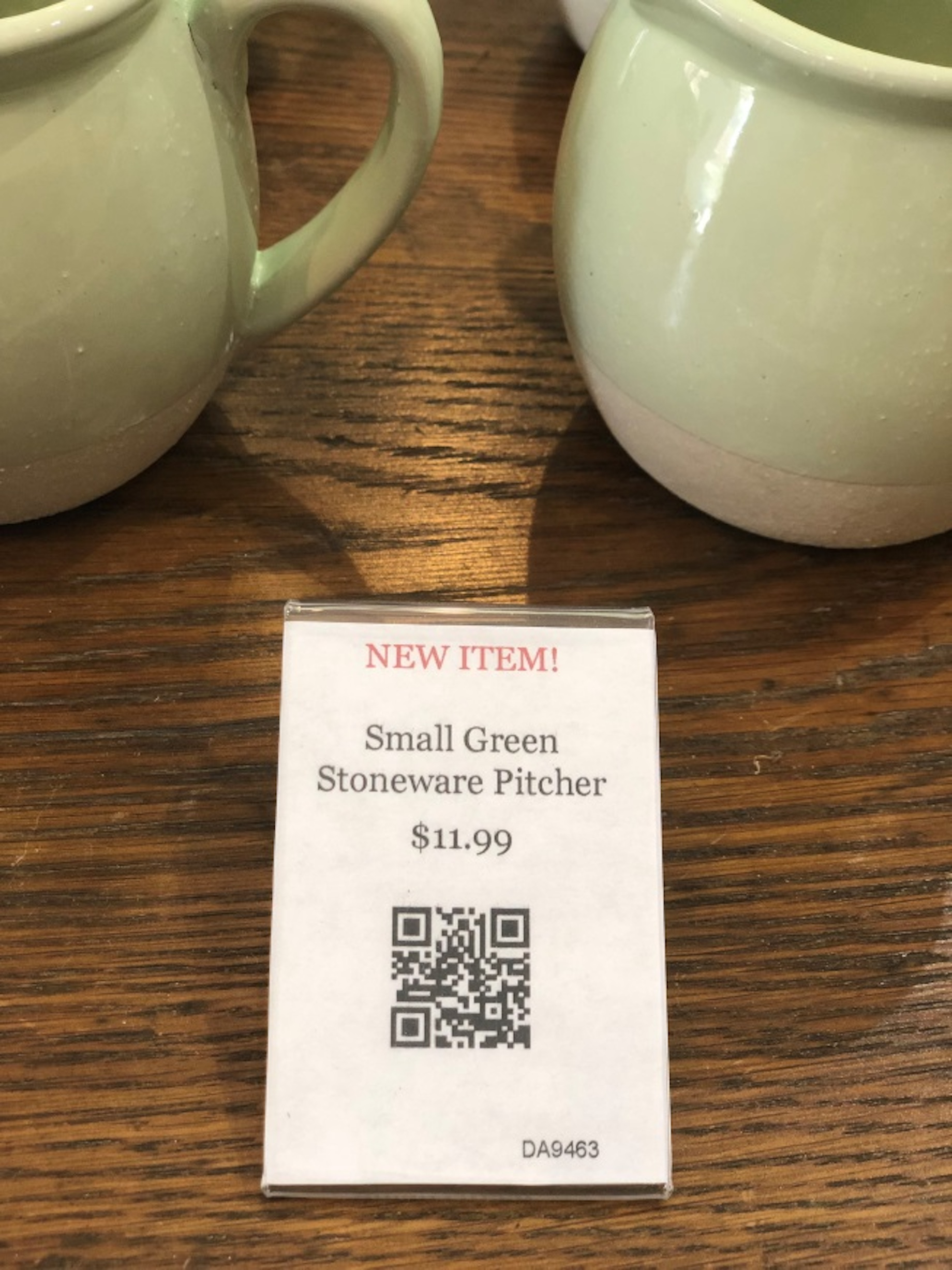
Pearl & Sons Furniture Design in St. Charles, Illinois, peppers its displays with signs that are the size of business cards. The QR code takes you to the store’s website for more information. QR codes are scannable images that can instantly be read using an app on a smartphone camera. The information stored on it is up to you. Think project supplies lists, how-to videos or more information about a particular product. You can make your own QR codes for free at QR Code Generator.
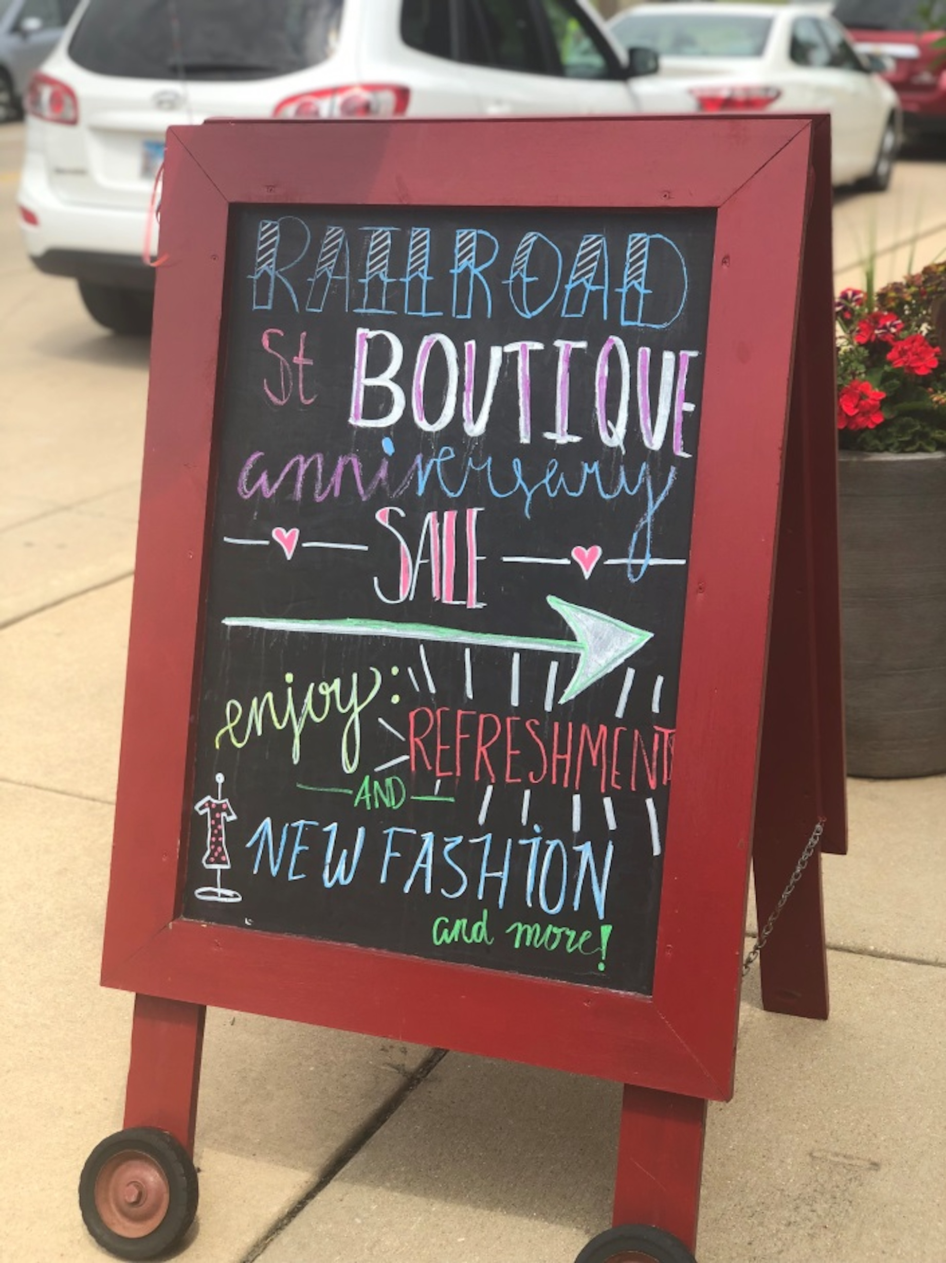
Easel signs are hot right now. They’re great because of their flexibility and the opportunity for you to exercise your creativity. A colorful easel sign can stop shoppers and draw them into your store. Easels aren’t for boring information; have fun with what you write.
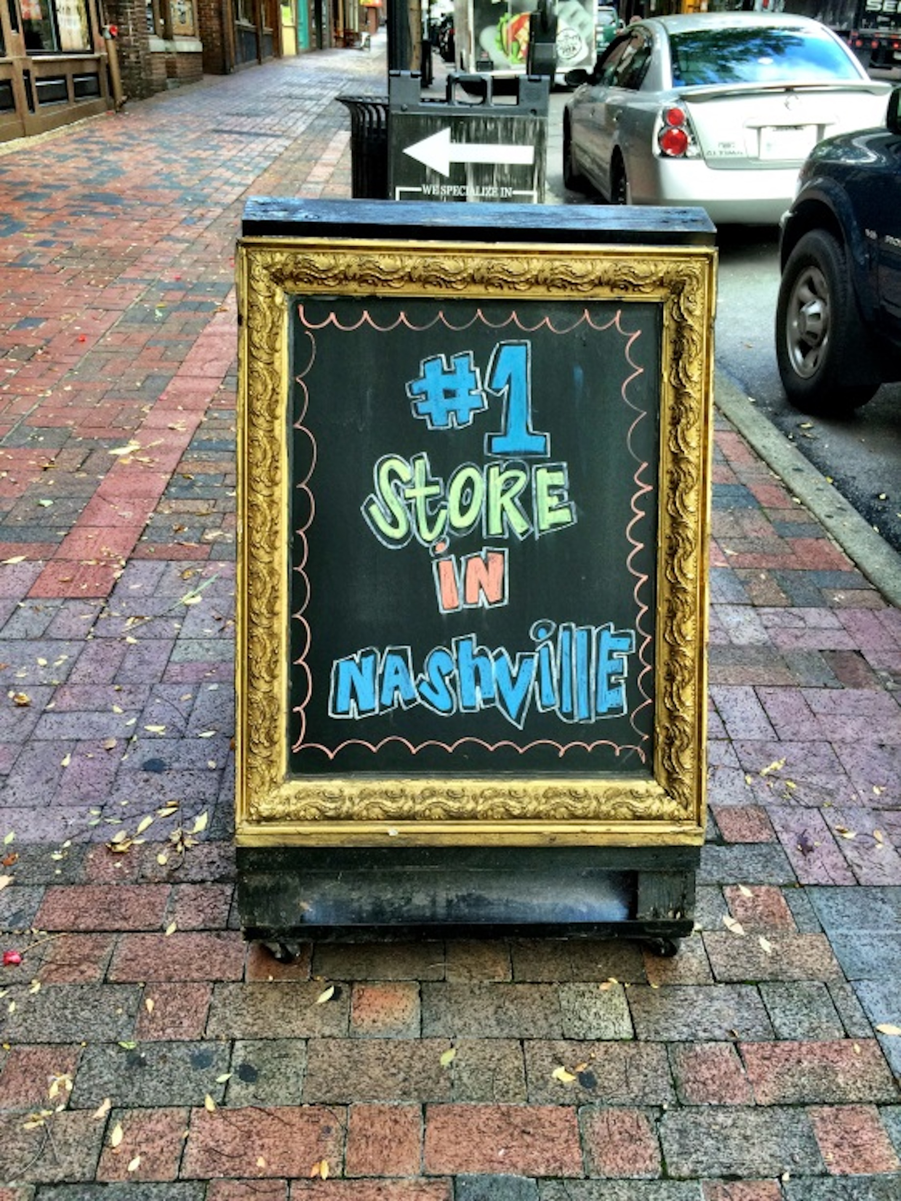
Toot your own horn because no one else is going to do it for you. Don’t be afraid to tell the world how good you are. Was this the No. 1 store in Nashville? Who knows, and who cares? This clever sign on a busy street full of indie retailers was enough to get us in the door.
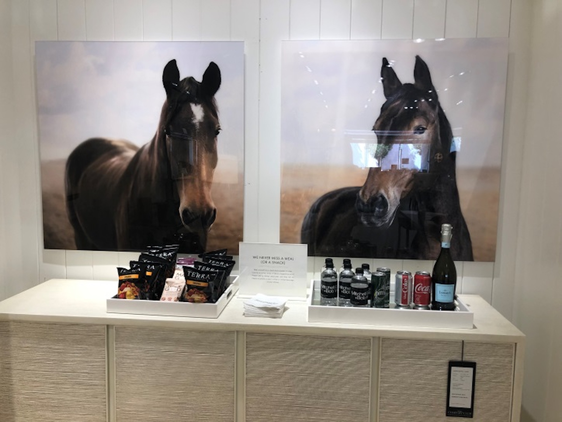
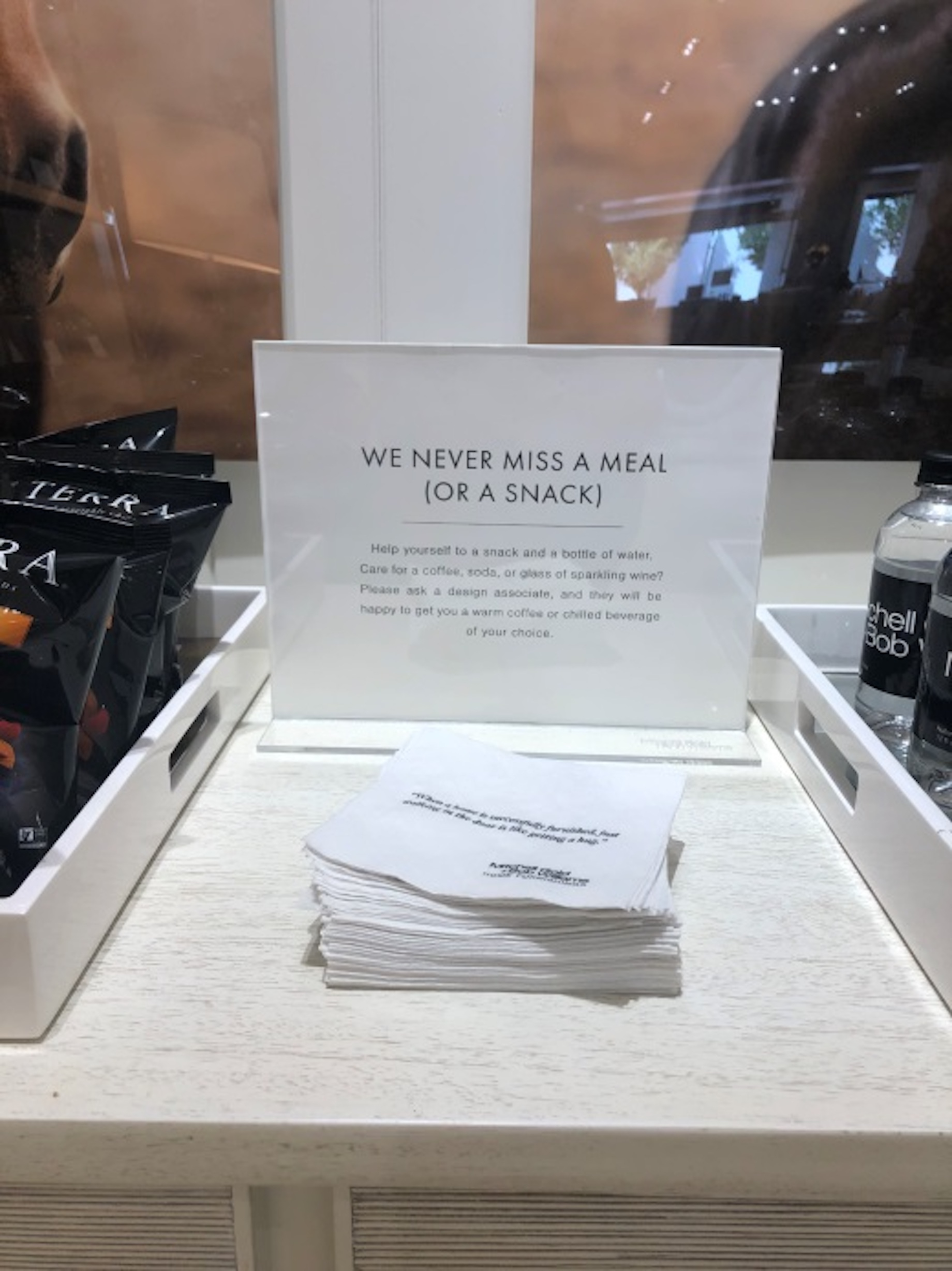
You know our in-store-events motto, right? Food is good. Mitchell Gold + Bob Williams home furnishings echoed that sentiment with, “We never miss a meal (or a snack).” When you feed people, they tend to stay longer and spend more money while they’re there. The credenza and art pictured above it are for sale; the snacks are complimentary.
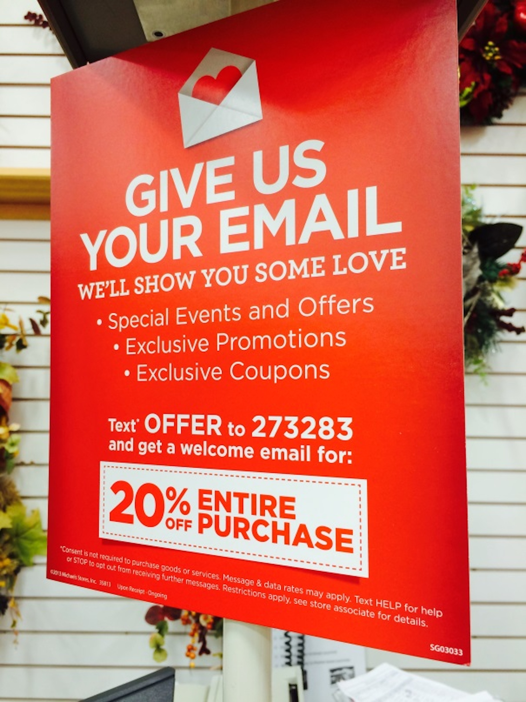
Email is still the most cost-effective way to connect with customers, and Michaels knows how important it is to get customers’ email addresses. This sign located at each checkout got our attention, all right. We like how it lists what’s in it for the shopper. The 20% off sweetens the pot, but you don’t have to go that far if you don’t want to. The word “exclusive” is enough to get a shopper excited.
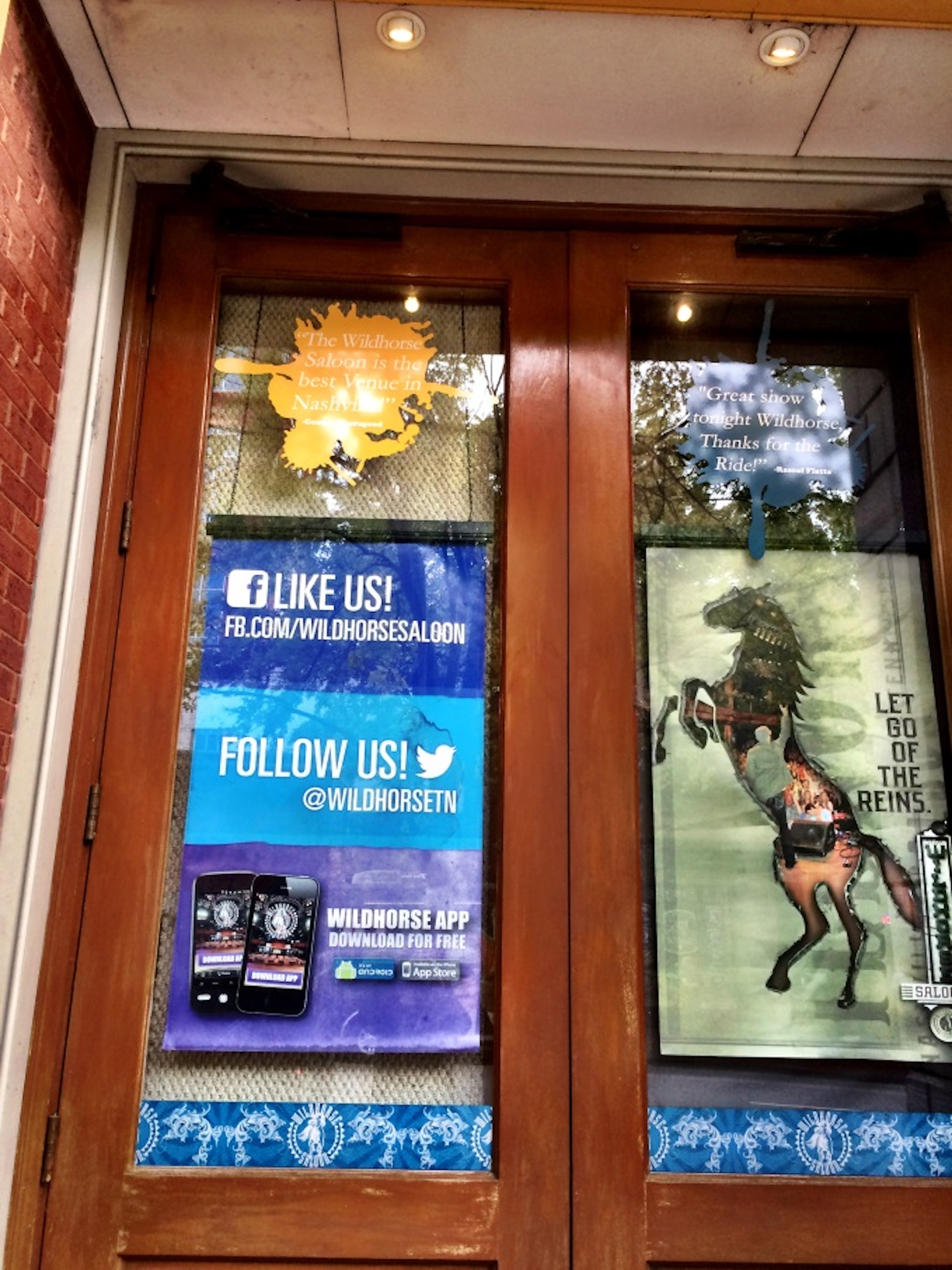
If you want customers to hang out with you on social media, you need to let them know where they can find you. And make it easy. This door sign is too large, but the info on it is just right. The sign doesn’t merely read, “Follow us.” It lists the bar’s @ info, as well.
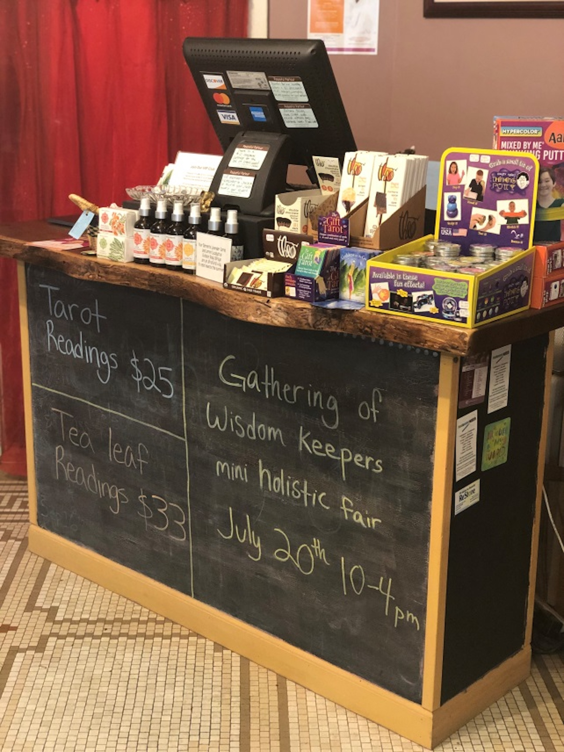
Peaceful Parlour in Geneva, Illinois, turned the dead space under its cashwrap into a space to share information about specials and upcoming events. Every time we visit this store, we see almost every shopper stop to read the cashwrap. We always read it, too!
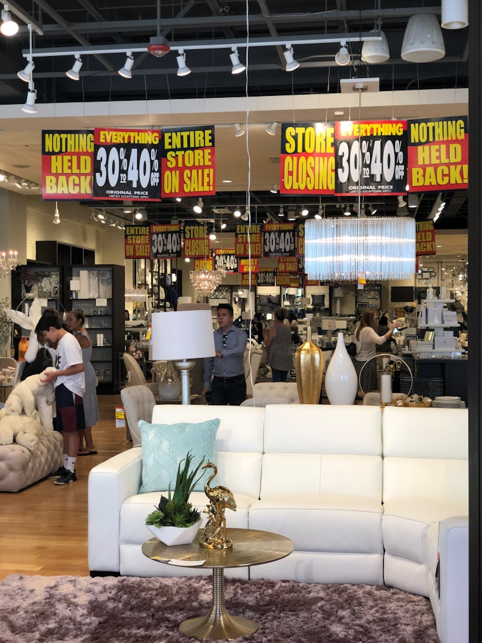
Look up for a solid example of sign pollution. This store gets a pass here because it’s closing and that wall of yellow, black and red is supposed to get your attention. It definitely does. But in every other situation, this many signs will stop a shopper from staying in the store.
What’s Next?
We began this article with a stat from a Salesforce survey, so let’s end with one, too: Brick-and-mortar stores remain the preferred purchasing destination for every age group. Yes, you read that correctly: every generation still prefers to shop in physical stores. But your store has to be worth the trip — and a repeat visit. Choosing the right mix of basic and fashion items, combined with accessories and fun impulse products is essential. Merging these categories in irresistible displays — shopper stoppers — is what it’s all about. In a competitive retail world, repetition is the kiss of death.
This article originally appeared at www.retailadventures.blog.