By Francesca Nicasio, Vend
www.vendhq.com
Your retail signage is one of the first and the last things customers see when they visit your store. Signage directs the flow of customer traffic within your brick-and-mortar shop and, if done incorrectly, it can lead to a lot of confusion on your sales floor. For your business to effectively draw customers in and direct them through your store in a manner that’s efficient and lucrative, you first need to become proficient in the fine art of retail signage. Let’s take a look at the different types of retail signage and discuss how you can design and set up signs that grab customers’ attention.
Tip 1: Big Fonts
Customers need to be able to read your retail signage for it to be effective. When determining your ideal font size, put yourself in your customers’ shoes: Will they be driving by your sign in their cars, walking past them or encountering them on product labels? Senior citizens or people with eyesight issues call for larger fonts, as well. Keeping this in mind will help you to determine how big your font needs to be to reach all your customers.
Another thing to consider when choosing fonts is the clarity of the text itself. Obviously, you aren’t going to be able to reach prospective customers with Wingdings, but certain cursive and Italic fonts are also super risky. It all depends on the visibility of the font from customers’ eye level. So, use fonts on your signage that are clear and on brand for maximum impact.
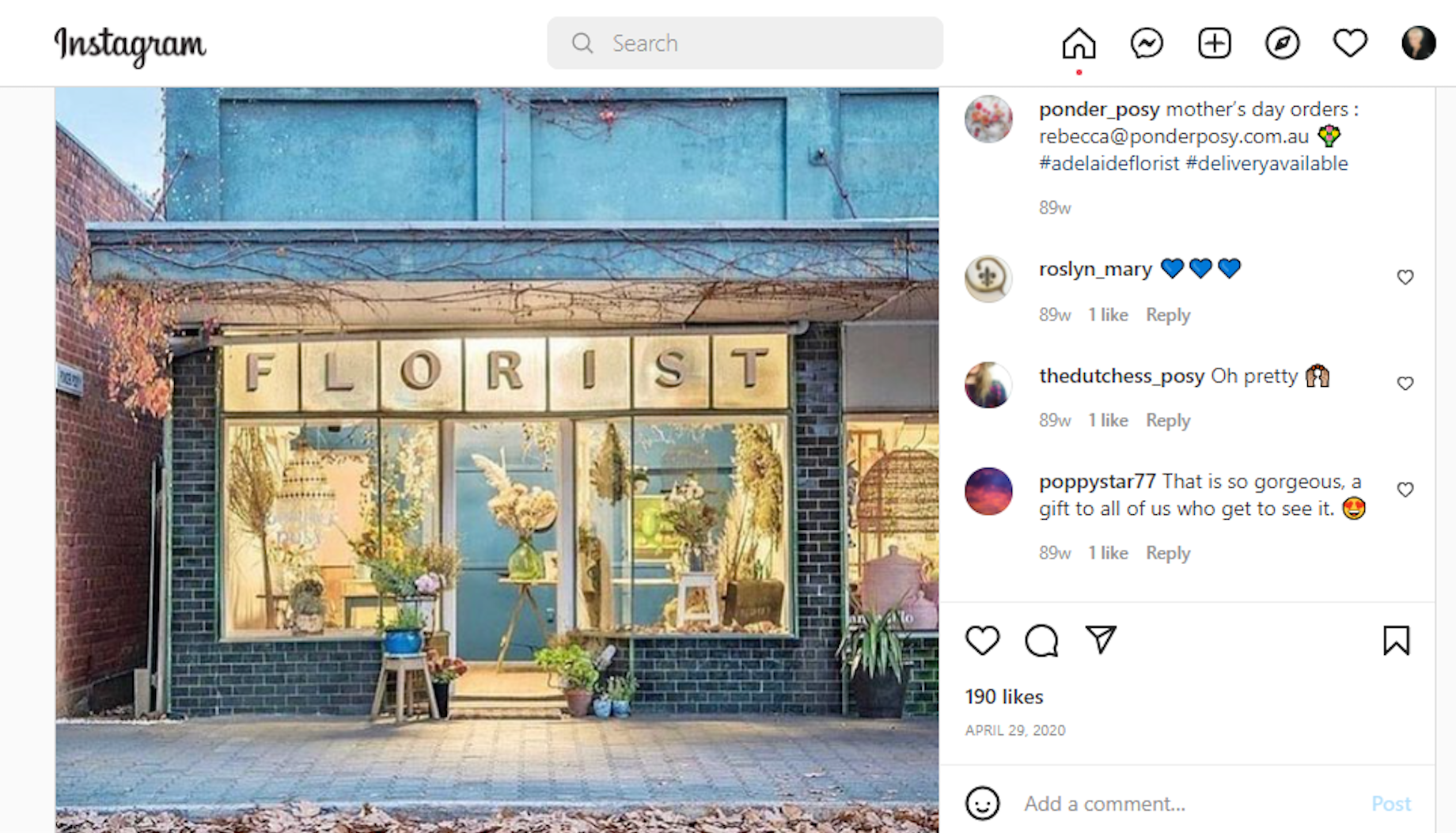
Check out this example from Ponder Posy, a flower shop in Australia, which uses a large, easy-to-read font for its store. Ponder Posy’s signage makes the store easy to spot, and the fact that it says “florist” in big, bold letters means people know exactly what the shop is all about.
Tip 2: Right Sign for the Right Function
All retail signage is not created equally. Understanding the purpose of your retail signage is pivotal to making the right investment. It’s one of the big the “why”s of the visual merchandising trade. Let’s take a look at four types of retail signage and what you need to know about them.
Outdoor Signage
Your outdoor signage is the first impression that customers get of your store. Because of this, it needs to be bright and compelling enough to capture their attention. This is often done through humor, but it’s also important to show your brand logo and at least a teaser of the type of inventory you have in-store.
The bottom line is that customers need to be enticed to come in when they read the copy on your outdoor signage. Just putting out a funny saying without any type of inventory tie-in won’t cut it if your store is in an area where passersby aren’t already familiar with your offerings. Outdoor signage should be changed often, if not daily, to drive business from repeat passersby.
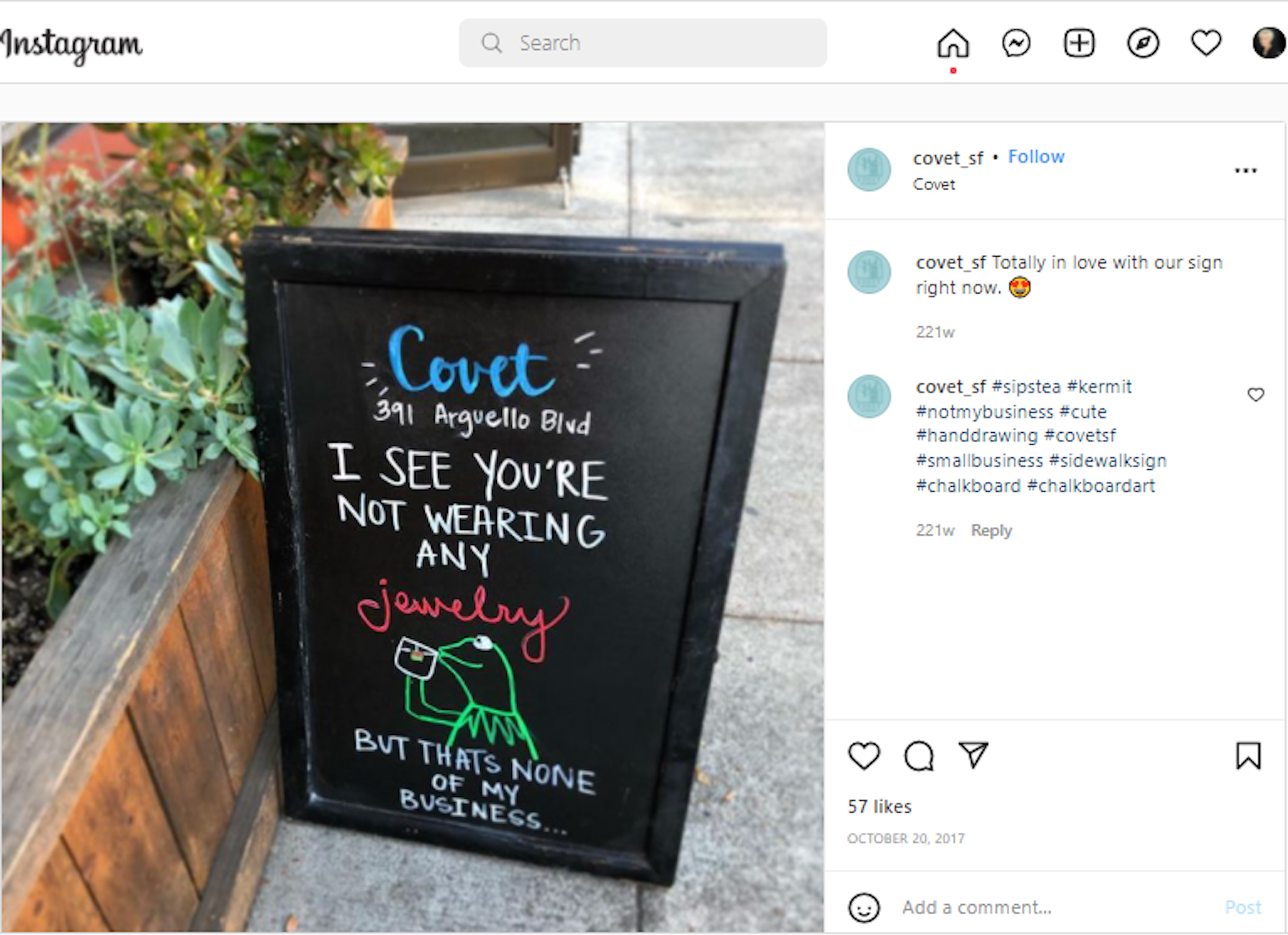
Here’s an excellent example of outdoor signage done right, care of Covet, a jewelry retailer in San Francisco. The sign makes great use of color, humor and wit to entice people to walk in and shop for accessories.
Directional Signage
Directional signage is a type of indoor signage. These are the signs that help customers navigate through your store. Most of these signs will hang from the ceiling and be readily visible when customers walk through the front section to help time-pressed consumers locate the items that they came in for.
You don’t want to get too witty with directional signage; it’s there to save your customers time.
However, you should consider offering signage that is Americans with Disabilities Act compliant to help all customers navigate your store effectively. There are two ways to go about making your in-store signage ADA complaint: Navigate ADA-compliance standards yourself by consulting the official ADA Standards for Accessible Design, or hook up with an ADA-compliant-signage provider that can help get your store’s ADA signage game up to snuff. Directional signage only needs to be changed when signs begin to show wear or when your store is remodeled. Note that directional signage can also come in the form of floor decals.
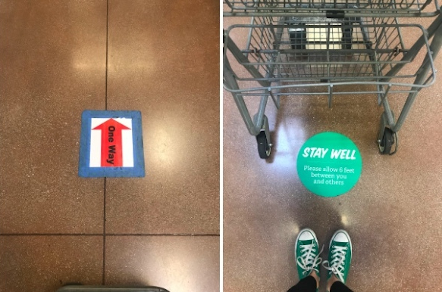
The grocery chain Sprouts Farmers Market has made good use of floor signage during COVID-19 to direct the flow of traffic in one-way aisles and to encourage social distancing.
Promotional Signage
Here’s a fun one. Promotional signage uses language that will lure in your key customer demographics. Now, if you’re not aware of what wording to use to attract prospective customers, do background research on the lingo their favorite brands use on social media. Is their tone humorous? Rebellious? Practical? What words do they use? Now, your challenge is to take this insight and make it applicable to your brand voice and inventory. Give customers enough information about your products to make them want them, but, as always, beware of cluttered wording when you’re communicating what’s special about your brand. Promotional signage should be changed regularly to communicate sales.
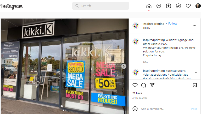
For some retailers, big, in-your-face signs” work well, as in this example from the Kikki.K.
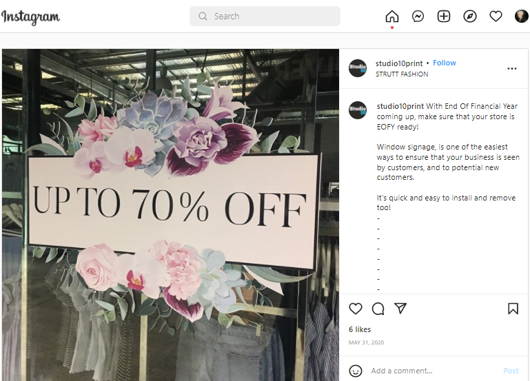
But this approach isn’t for everyone. Some retailers, such as Strutt prefer a more understated approach.
Digital Signage
Digital signage can be used to personalize your customer’s shopping experience. Most retailers have already used digital signage to improve the customer experience. The benefit with digital signage is that it gives you the versatility to customize your message depending on the weather, time of day, what you’re selling and even who walks into your store. As you know, customization is key to driving sales with modern customers, but there’s a fine line between customization and creepiness. And syncing customers’ browsing history to your digital signage without their express consent? Not a good idea. A study held at the 2019 Digital Signage Expo found that creating too personalized an experience can alienate customers, so make sure you get their buy-in when creating a customized ad experience with digital signage. Digital signage can be updated easily on the sign itself or in-app, so you should change it regularly to meet your diverse customers’ needs.
Tip 3: Where to Position Signs
There are certain standards in the signage industry that dictate where customers will look to find your signage. Directional signage, for instance, will hang down from your ceiling or be higher than eye level in the aisle so customers can see it when they’re passing through. Promotional signage will be positioned at eye level in your window display or at ground level on the street to attract meandering passersby. Keep in mind that eye level is different for different people: kids, customers in wheelchairs and people in cars have different sign height and font size requirements, so test signage positioning yourself to determine the most effective height for your prospective customers while considering each sign’s intended function.
Tip 4: Bold and Concise Copy
When it comes to signage copy, there’s nothing worse than too much verbiage. Don’t let clutter obscure your store’s message. Always use the minimum number of words necessary to get your message across. However, it’s equally important to remain aware of how many signs are posted in a given area. There’s little as disconcerting for a customer as being bombarded with lots of wordy, cluttered signage when they’re trying to browse your selection or to make a purchase. It’s not a professional look. Instead, be sparing with your wording and keep the intent of your retail signage in mind. And never — I repeat, never — use all caps on a sign that addresses your customers. This comes across as yelling and it is flat-out disrespectful to the people spending money in your store.
Tip 5: Color
There are a lot of subconscious factors at work when customers look at signs. First of all, use high-contrast colors in your retail signage: black with white, dark with light and so on. This can boost customer responsiveness by about 23%.
Another important factor to take into consideration is color theory, or the emotions and associations we experience when presented with a given segment of the color wheel. It’s important to understand the subconscious associations conjured by each color so you can make sure that they’re in line with the image you want to present. Here are some of the basics of color theory:
Cool colors like green, blue and aqua impart a tranquil vibe. These are great for ecofriendly or self-care brands. Blue also conjures a sense of trust, so it’s awesome for financial institutions. Purple is an introspective, soothing color. Use purple for spiritual and/or cosmetic lines and products. Warm colors like red, orange and yellow, on the other hand, get customers’ blood broiling. This is why the traditional sale or clearance sign uses a bright red hue to impart excitement. Yellow is also an optimistic color that’s great for attracting young consumers. Black is associated with strength, power and luxury. It’s perfect for high-ticket items like jewelry and luxury footwear. White communicates hygiene and/or new beginnings — think weddings, lab coats and kitchen appliances.
Bringing It All Together
Your implementation of retail signage can make or break your in-store experience. From the chalk sign outside your store’s doorstep to the directional signage indicating where the exit is, each sign needs to be concise, witty, easy-to-see for all customers and on brand. Maintain an awareness of the many uses for retail signage and put advanced practices like color theory and font to work in your store to make ensure that your retail signage never falls flat.
The article was originally published at www.vendhq.com.