By Francesca Nicasio, Vend
www.vendhq.com
We all know that humans are highly visual. This is where retail design comes in. If you’re a running a brick-and-mortar store, it’s important that you take some time to thoughtfully arrange merchandise to maximize conversions.
1. Create an immersive experience.
Great retail design isn’t just about a well-curated display or attractive visual merchandising; it’s about the experience that you create using the various components of your store. When cooking up retail design ideas, make it a point to think about the big picture. What’s the overall experience that you’d like shoppers to have? What feelings do you want to evoke? The answers to these questions will help you craft retail designs that make a strong impression on your customers. Have a look at what Aesop is doing. The skin, body, and haircare brand strives to incorporate “intelligent and sustainable design” in all of its workings, and this extends to Aesop’s brick-and-mortar stores.
And while all of its stores incorporate the clean and modern look that Aesop is known for, it also adds a local flavor to each shop so every location reflects the neighborhood that it’s in. When constructing its store in Los Angeles’ Silver Lake district, for example, Aesop came up with a retail design that reflected the spirit of the neighborhood — which is known for cultivating independent art.
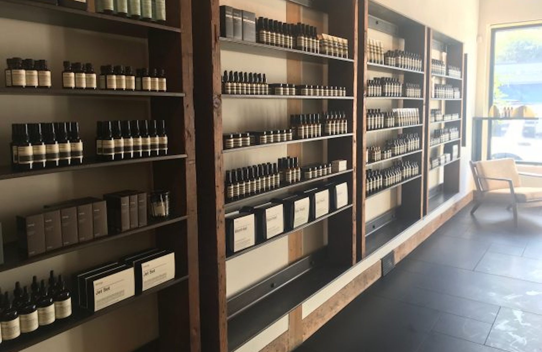
According to the webpage for Aesop’s Silver Lake store in Los Angeles: “Black basalt, Douglas Fir and gypsum panelling are key materials here, evincing a simple, natural palette in a sleek contemporary setting of distinctly eclectic references — the prehistoric geology of the Los Angeles Basin, twentieth-century lunar exploration, and ancient architecture from Stonehenge to Mesoamerica.”
Strive to incorporate that same level of thought and detail into your retail designs. Think about what your brand stands for and find ways to make it come to life in your location. Like Aesop, you could also inject some local flavors to ensure that people feel right at home.
2. Set your layout based on the flow of traffic in-store.
You want people to see your best and most enticing products or displays first, so you’ll need to know where they go or turn to when they enter your shop. Do they tend to move to the left or right? Where do their eyes go? These are just some of the questions you should ask when merchandising your store.
Fortunately, research offers some insights into retail traffic patterns. Studies have shown that the flow of traffic in-store may actually be influenced by vehicular patterns on the road. In the 2009 book Inside the Mind of the Shopper: The Science of Retailing, Herb Sorensen wrote: “The pattern of movement in the supermarket is counterclockwise in the United States, but PathTracker studies in the U.K., Australia, and Japan show a much greater tendency for shoppers to move in a clockwise pattern there. … Traffic patterns in the store may also be affected by vehicle traffic patterns outside. In these small studies, we noted that in countries with right-hand driving, where traffic circles move in a clockwise pattern, shoppers in stores may be more comfortable moving the same direction.”
With this information in mind, it may behoove you to lead customers to the right if you’re in the U.S. or in a country that enforces right-hand traffic. But if you’re in the U.K. or Australia, it may be best to arrange your store to support people moving in a clockwise direction. That said, while research certainly offers some insights into in-store traffic, you shouldn’t base all your merchandising decisions on external studies alone. Be sure to make your own observations to figure out the traffic patterns of your own customers. Use foot traffic tools to analyze how customers move about in your store, or just be more observant and pay attention to where shoppers go and the things they look at when they come in.
3. Don’t put merchandise in the decompression zone.
Avoid putting too many products or signs near your entrance, also known as the decompression zone. Shoppers in this part of the store likely are still adjusting to the new environment, so they tend to miss any items or fixtures in this area.
4. Add breaks or speed bumps.
Repetitive fixtures or aisles in your store could result in shoppers skipping over your merchandise. We can see a lot of supermarkets putting visual breaks within long aisles. Because these types of stores have a lot of aisles, supermarkets often place large, attention-grabbing displays at the ends of their aisles to invigorate their store layouts. The Lion’esque Group CEO Melissa Gonzalez says that setting up “speed bumps” in-store is a good way to keep shoppers intrigued. These bumps can be “well-merchandised outfits, deeper information about key product offerings or an interactive element such as touch screens or augmented reality.” Sephora does this really well. Many of its stores are punctuated with speed bumps to stop people in their tracks.
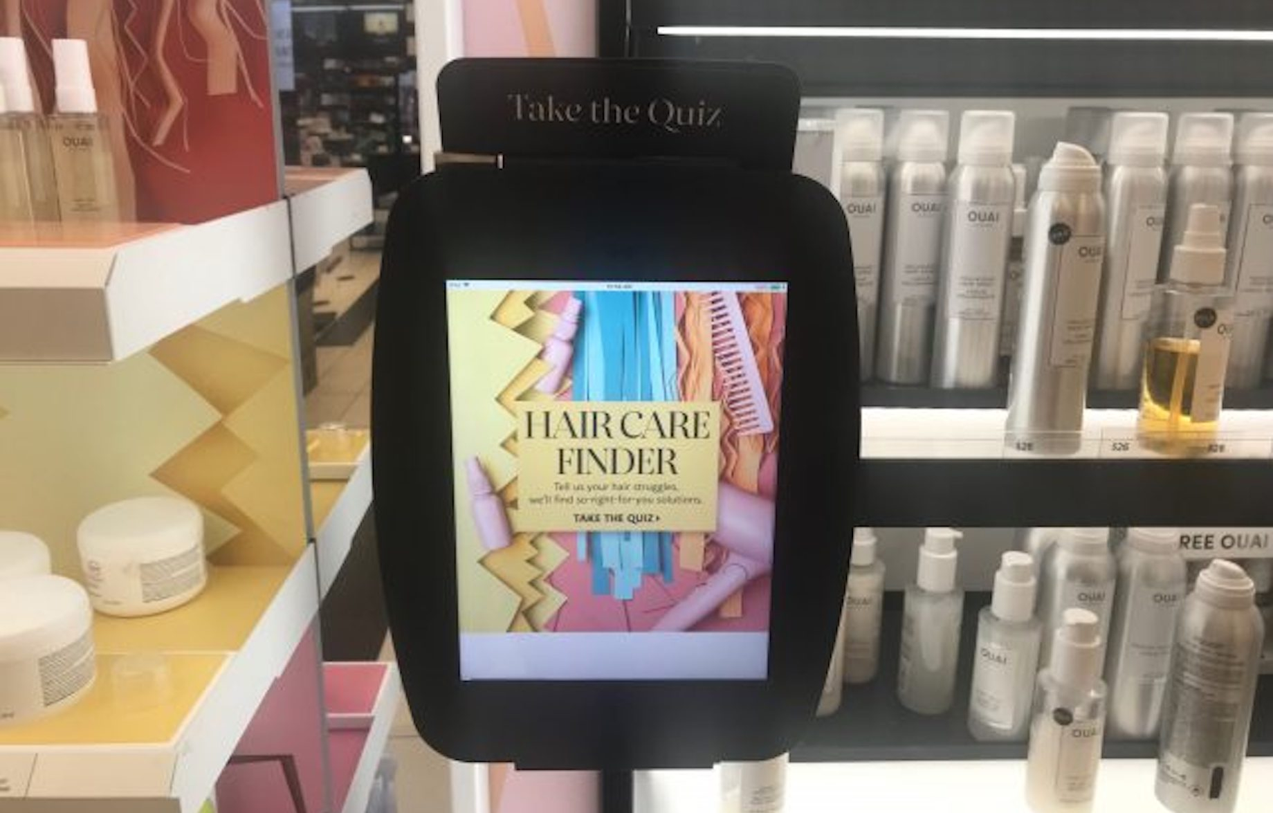
Sephora attached to a shelf this interactive display encouraging guests to take a hair quiz. In addition to creating an interactive experience, the touchscreen display acts like a speed bump to slow down guests as they browse the shelf. This helps ensure that they don’t skip over the products in the display.
Try to do something similar in your own retail design efforts. Add speed bumps or elements that would give shoppers a break from monotonous displays and aisles. Doing so encourages your customers to slow down their pace so they can view more of your products.
5. Make your retail display design larger than life.
It often takes big, bold initiatives to grab people’s attention, and the same thing can be said for retail displays. Depending on the theme of your display, it may make sense to incorporate large elements into your design. Think life-size installations and fixtures.
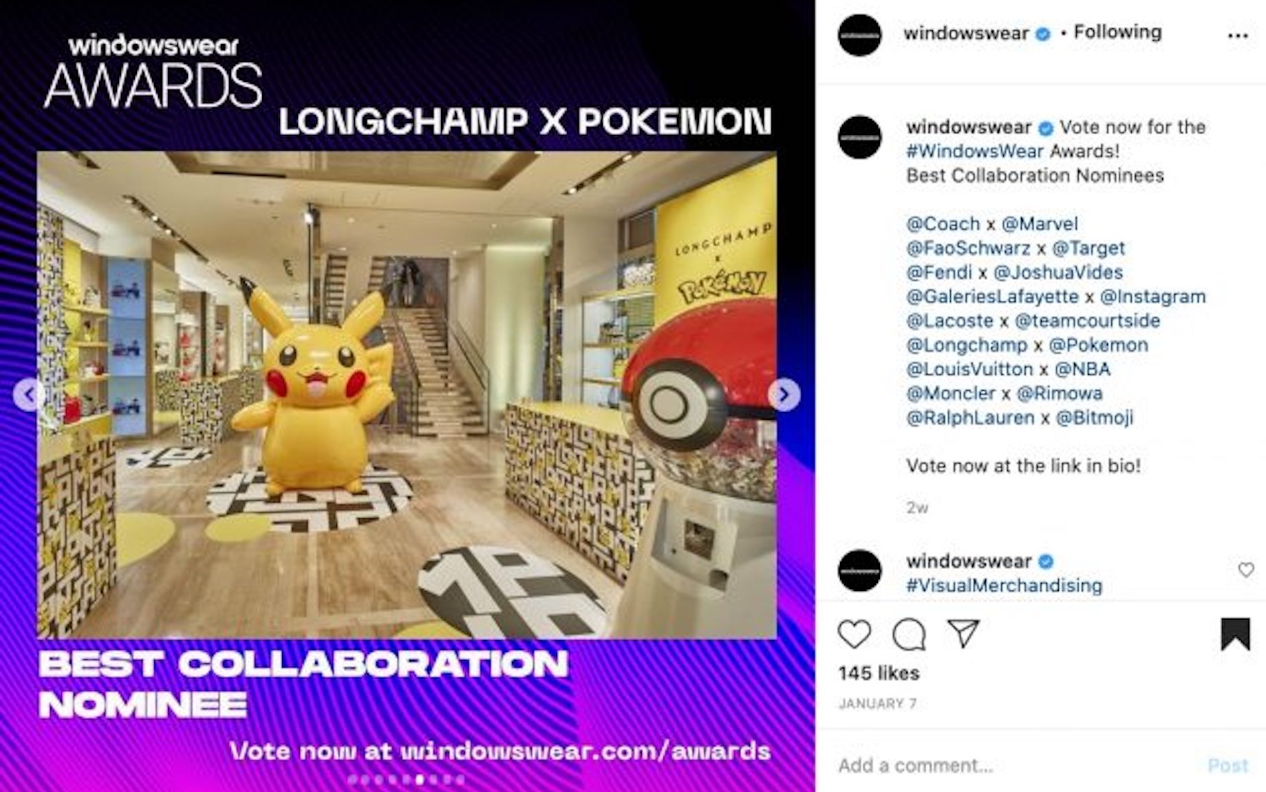
When Longchamp teamed up with Pokemon, the fashion brand didn’t just put the Longchamp x Pokemon products on a table and call it a day. Rather, the company went all out by having a larger-than-life Pikachu statue and Pokemon gumball machine.
6. Throw QR codes into the mix.
If you’re social distancing in-store, consider adding QR codes to your display design. QR codes made quite a comeback in 2020 because they served as a good solution for more hygienic customer interactions. Many restaurants, for example, displayed QR codes on their tabletops rather than handing menus to diners. A similar principle can be applied to retail. If you’d like to minimize face-to-face interactions between guests and staff, add to your displays and posters QR codes that customers could scan if they wanted to learn more about your products or store.
7. Create focal points in all your displays.
While it’s tempting to try to bring attention to anything and everything in your store, tried-and-tested design principles tell us that having just one focal point, preferably at eye level, is far more effective in drawing people in. So whether you’re arranging your latest window display or setting up a new fixture in the middle of your store, be sure to design it with one focal point in mind. Pick one thing that you want to highlight, position it at eye level and then strategically position other items and lights to bring attention to it. In doing so, your displays will have greater chances of catching the attention of shoppers. And once you have them hooked, they’ll naturally check out the other products around the focal point.
8. Don’t overstuff the space.
Have enough open space in your store so people can really appreciate your products and move around without bumping into merchandise or other shoppers. Doing so will benefit you in two ways:
- It’ll prevent the “butt-brush effect”: In the book Why We Buy, Paco Underhill talks about the butt-brush effect, a phenomenon wherein shoppers would abandon displays or products they were looking at when they were bumped once or twice from behind. He wrote: “While reviewing the tape to study how shoppers negotiated the doorway during busy times, we began to notice something weird about the tie rack. Shoppers would approach it, stop and shop until they were bumped once or twice by people heading into or out of the store. After a few such jostles, most of the shoppers would move out of the way, abandoning their search for neckwear. We watched this over and over until it seemed clear that shoppers — women especially, though it was also true of men to a lesser extent — don’t like being brushed or touched from behind. They’ll even move away from merchandise they’re interested in to avoid it.” If you have spaces in your store that subject shoppers to the butt-brush effect, you could be losing customers and sales. Take a look around and free up any tight spots that could be making people uncomfortable.
- It keeps your store light and airy: In addition to letting people have their personal space, having a roomy store allows customers to better appreciate your merchandise. It makes them feel like a store is thoughtfully curated.
9. Use signs wisely.
Attractive, well-positioned signs not only will catch people’s attention, but also can add value to your displays and the shopping experience overall. In addition to setting up eye-catching signs to entice people to check out your new arrivals or promotions, find ways to use signage to inform and educate.
10. Update your displays regularly.
Design and appearance aren’t the only factors that contribute to success of your retail displays. How often you update them also matters. Displays get stale pretty quickly in retail, so change them up regularly. Retail expert Bob Phibbs recommends that you change them monthly. “Holidays and seasons only last so long, and promotional goods have a short shelf life. Feature new arrivals first,” he adds.
11. Make them photogenic.
It’s no secret that consumers love their mobile devices and social media. We live in an age when documenting experiences is the norm and shoppers are often happy to share their retail experiences — if you give them the opportunity to do so. To that end, see to it that your retail design initiatives do their part in encouraging your customers to snap photos and share them on social. The first step to doing this is to craft photogenic displays. You should make sure that your store looks great in person and in photos. You can do this by taking pictures of your shop and seeing how it looks through the lens of the camera. You could even take things a step further by actively encouraging people to take photos.
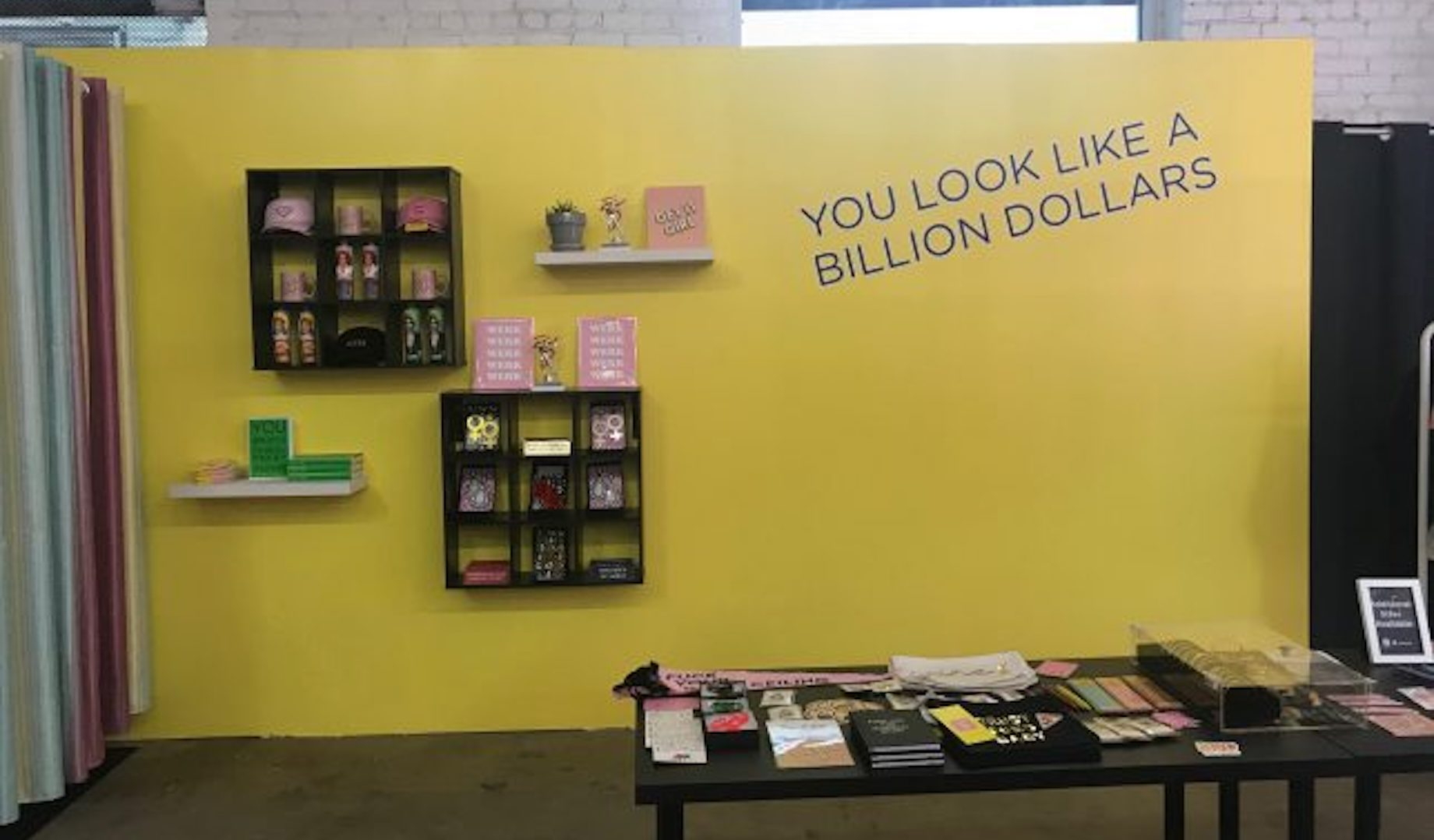
This Stacks House pop-up, which promotes financial empowerment for women, was dedicated largely to Instagram experiences. However, it also had a retail space that was curated and designed in such a way that it looks great in photos. The space encourages guests to snap photos via the text displayed on the wall.
12. Use your checkout counter to display impulse buy items.
If you aren’t leveraging your checkout space, you’re leaving a lot of money on the table. So encourage those impulse purchases by setting up displays on your checkout counter. They don’t have to big or fancy; the best impulse buys are easy to grasp, both physically and mentally. They should be simple and inexpensive enough that you won’t have to do any explaining to the shopper.
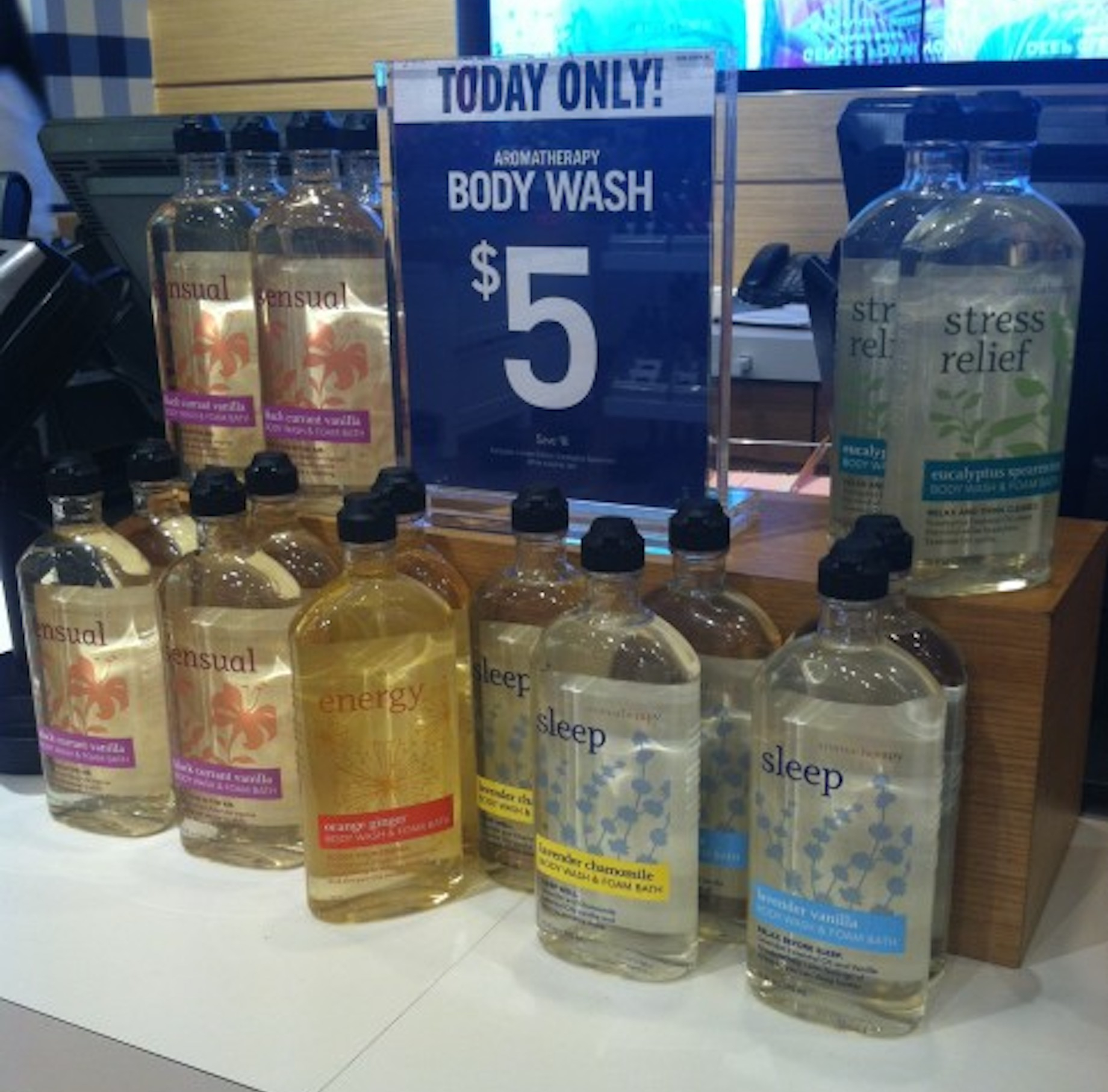
To encourage customers to purchase body wash, Bath & Body Works displayed the items on the checkout counter and even threw in a limited-time offer to sweeten the deal.
Retail design has always been an essential component of any store strategy, but these days, it’s more important than ever before. The retail landscape is a lot more competitive, and the best strategy to win is to create experiences that set you apart from other shops. Having a strong retail design strategy helps you accomplish that and more.
This article was originally published at www.vendhq.com.